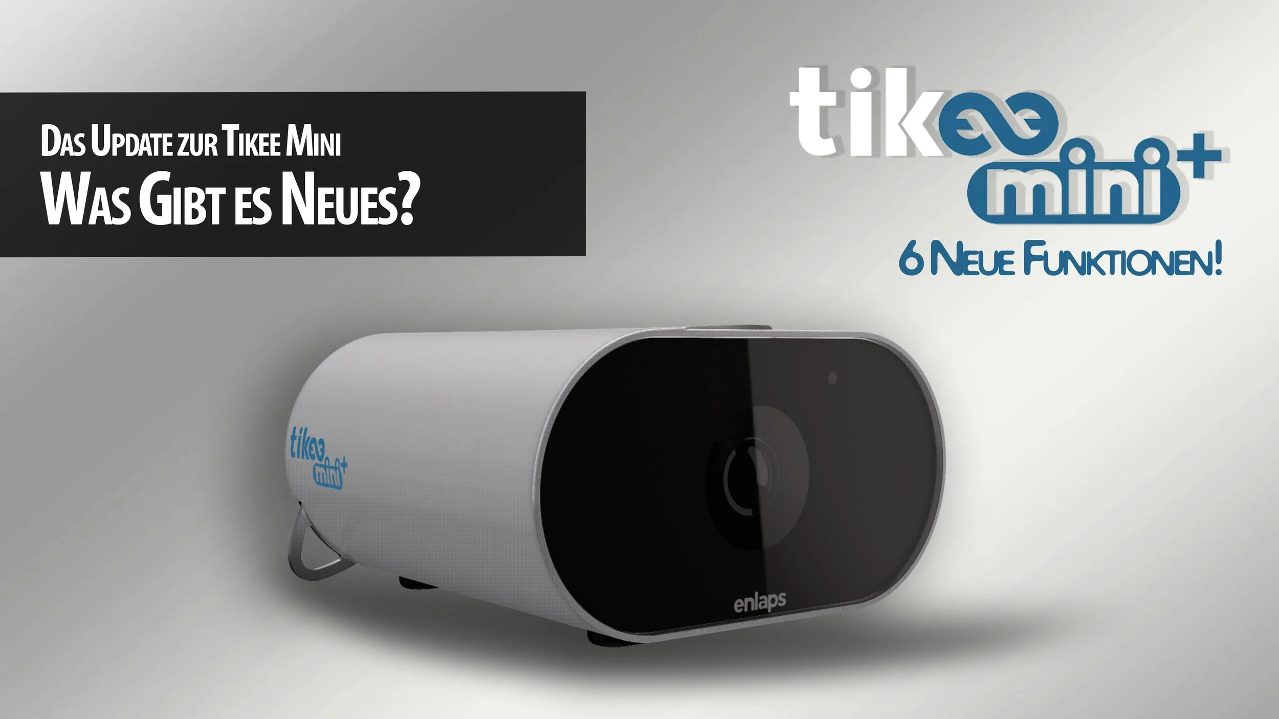
A new member of the Tikee family, and it’s not a camera: Tikee Sentinel
My thoughts on the new Tikee Sentinel motion detector just released by Enlaps.
I’ve been taking timelapse videos for almost 15 years, see some of them here, and recently have been working with the long-term timelapse solutions from Enlaps, after they contacted me and asked if I’d be interested in a review unit. You can see my previous articles on their cameras and ecosystem here, but this time we have something new!
COUPON CODE FOR ENLAPS.COM
Get 50 EUR off of a Tikee product:
FK-ENLAPS
A few weeks ago I got an invite from Enlaps for a product presentation: a new member of the Tikee family, but this time not a camera! Curious what it would be, I was keen to see how they’d expand their industry-leading long-term time-lapse and project-monitoring ecosystem. It turns out the new addition is a high-end motion sensor. While on the surface that may sound a little less exciting than a new camera, it actually brings a whole new set of possibilities to the platform.
Hardware
The Tikee Sentinel is a small (less than 10 cm on the longest side) and light (150 g) industrial motion sensor that is completely wireless, lasting around two years on a single charge via USB-C. It’s made for all kinds of environments with an IP66 rating, similar to the Tikee cameras, and has a detection range of 9 metres through a PIR lens that covers a 120-degree horizontal field of view. The device also features an ambient-light sensor.
It pairs with any Tikee 4, Mini, or Mini+ camera on the same site, within a transmission distance of around 30 metres in the open.
Features
The Sentinel is meant to deliver three things to users of the Tikee ecosystem: Detect, Capture, Notify.
After setup through the Tikee Remote App and pairing it with a Tikee camera, you can configure its sensitivity and set up the motion-detection pattern: during the day, at night, or anytime.
On the Tikee camera side, you can then configure the behaviour of the camera when motion is detected: capture a photo, video, or a burst of images. You can also determine if the camera should trigger this action only outside its normal shooting-sequence hours, or anytime motion is detected. Of course the Tikee cameras with their wide field of view and excellent image quality can deliver excellent evidence of whatever triggered motion that goes beyond the capability of simple traditional webcams.
The Sentinel is also fully integrated with the myTikee cloud platform. This allows you to set up immediate notifications via email to various interested parties for motion events and associated images, by selecting who gets notified and in what timeframe.
Speaking of the mytikee platform, it recently received a welcome update to its subscription model, in my view bringing more value and flexibility to the base subscriptions. Additional storage is now an extra add-on, as is the AI monitoring function.
Watch the Enlaps recap video here to see the features in action:
Use Cases
A primary use for the Sentinel will likely be construction sites, allowing companies to monitor storage areas, access to the site, restricted zones, and general site conditions outside working hours.
This is ideal for sites that already use the Tikee for documentation and monitoring, and allows them to add a layer of security on top of the same ecosystem with minimal implementation effort.
I expect this will be a common addition for anyone using Tikee devices on a construction, project, or event-setup site, but I can imagine it could also be interesting for certain types of nature monitoring—for example wildlife or glaciers, triggering on ice-calving events.
Pricing: The Sentinel is priced at 189 EUR excluding tax, and there are new packages available combining Tikee Mini or Mini+ and their accessories with the Sentinel, starting at 1488 EUR.
A great addition to the ecosystem.
A new mini in town: Enlaps Tikee mini+
My thoughts and review of the new Tikee mini+ term timelapse camera just released by Enlaps.
I’ve been taking timelapse videos for almost 15 years, see some of them here, and recently have been working with the long-term timelapse solutions from Enlaps, after they contacted me and asked if I’d be interested in a review unit. You can see my previous article on their flagship camera here.
COUPON CODE FOR ENLAPS.COM
Get 50 EUR off of a Tikee Camera:
FK-ENLAPS
They recently also added a smaller, more affordable camera to the portfolio, the Tikee mini, which I reviewed as well. It’s been just about a year, but they already sent me an updated version of the mini, aptly titled the “mini+”. However, I haven’t been paid otherwise, and my opinions here remain honest and reflect my actual impressions of the camera. Let’s see what’s new!
The Tikee mini - Recap
Let’s start with a quick recap of the Tikee mini - this was the first time Enlaps brought a new form factor to the market with a slightly different approach than the Tikee 4. As the name implies, it’s a lot more compact, and that partly comes from two changes compared to its bigger sibling: first, it doesn’t have a solar panel built-in, but still has the opportunity to connect one. With a huge battery built-in though, it can still work autonomously for weeks or even months at a time depending on the configuration. Secondly, it features a single wide-angle lens, as opposed to two of them for panoramic perspectives.
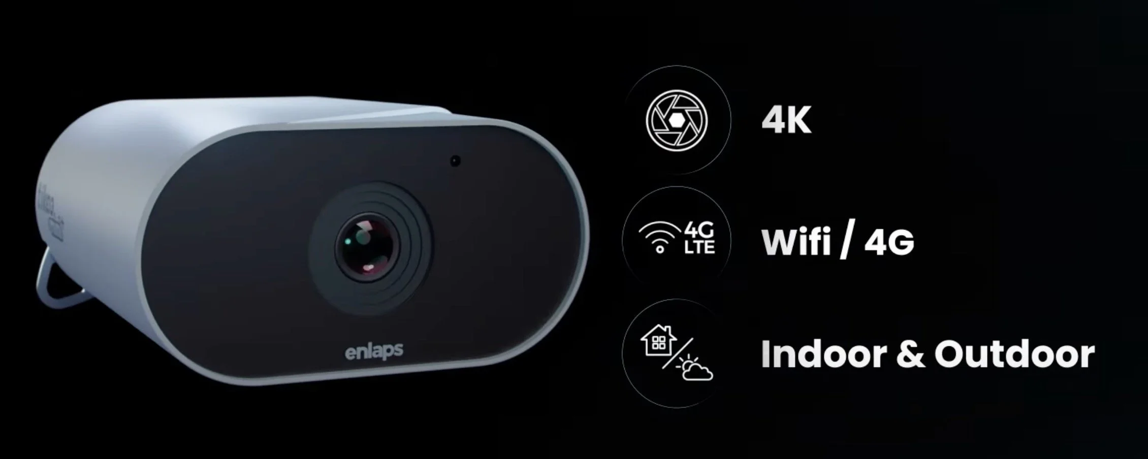
Other than this, the mini retains almost all of the features of the Tikee 4, including the built in WiFi and 4G, the ability to install it inside but also outside in harsh conditions, and a very high resolution image delivering 4k quality.
Of course, it also remains compatible with the mytikee cloud platform for easy remote monitoring, configuration changes, image storage, one click generation of timelapse videos and other media, and the AI functions for keeping track of projects, particularly things like construction safety and activity.
You can watch the (German + English subtitles) video review here, including a real-world test, or otherwise just read below!
What’s New with the mini+?
So what’s new on the Mini+? Well, as the name implies, it’s a revised version of the mini, rather than a full mini 2, if you will, so from the outside not much as changed. But there are a total of six new or updated features available.
Distortion Free Wide Angle: Let’s start with the most important to me: Enlaps addressed one of the primary complaints I had about the original mini, which is the heavy distortion of the wide-angle lens, giving almost a fisheye look. With the mini+, there is now a “True View” mode, providing the original 120° ultra wide angle view, but also 110° and 90° straightened distortion free options, which is great to keep lines straight, particularly in things like construction. While of course not a true zoom option, this also allows for a little bit of a tighter crop on the subject, which is sometimes useful.
Live Preview: We now have a way improved Live Preview function when setting up the camera in a new location, making it much easier and faster to check the composition and adjust the angle using the Tikee Remote Smartphone App for iOS and Android. This was always a little bit of a pain, so I’m glad it’s better now. The Live Preview also includes the True View mode setting in its preview, so you know exactly what you will get.
Fixed WB Option: For more advanced requirements, you can now fix and lock the white balance of the sensor, avoiding colour shifts depending on weather and light conditions or a changing subject. This is useful for things like Phenology where you need absolutely consistent reference colors in the image.
Vertical Shooting: Next, the camera now supports vertical shooting when turning it 90 degrees (it can be mounted upside down now and fix the image orientation for the final video automatically). This can be useful for social media content or skyscrapers, for example.
Advanced Adaptive Interval: There’s a more advanced adaptive interval function to further optimise battery life, which allows more flexibility to reduce shooting frequency as the battery degrades. This can almost double battery life in some scenarios and is also available for the original mini.
Low Light Performance: And last but not least, another point that we all want to see continuous development on: low-light performance has been improved, and the camera can now take long exposures up to 2 seconds, with better noise control in darker situations. This has already been a step forward in the Tikee 4 compared to its predecessor, so it’s great to see Enlaps keeps investing in this area.
Watch the Enlaps recap video here to see the features in action:
Ecosystem
The Tikee solution is arguably the best tool for creating long-term timelapse videos, making it as easy as possible to monitor projects, landscapes, and more over months or even years.
That obviously includes the cameras themselves, and the Tikee Mini + is a great addition to the portfolio.
But as I said before, it also includes the cloud platform, mytikee. Clearly we all would like to pay for fewer subscriptions, and there is always the option to use the camera with just the free (limited) version, and record images on the SD card.
But the ability to monitor the camera remotely, adjust all its settings, have images uploaded automatically, and get alerts in case of issues makes this just a very reliable option for professional use.
On top of that, the timelapse generation is so simple, no other solution I know of can compare to the automatic filtering of images, exposure compensation, stabilization. This used to take hours, now it’s a few clicks.
Summary
As mentioned, this is all in all not a huge update to the product, and some of the points seem focused more on software enhancements. For someone running the existing Tikee mini, an upgrade probably isn’t necessary, but for everyone who was on the fence about the original version, this new replacement makes it an even more attractive camera.
It’s a welcome set of “quality of life” improvements for Enlaps users, just one year after the mini was originally released.
Enlaps Tikee 4 - Best of Breed?
My thoughts and review of the new Tikee 4 long term timelapse camera just released by Enlaps.
As some of you know I’ve been taking timelapse videos for over 10 years, some of which are posted here - it was probably for this reason that Enlaps contacted me last year, to see if I wanted to take a look at their Tikee 3 camera. I did a review - see here - and have been using it for 12 months on a construction project, see the video below exported straight from the myTikee cloud platform. It did an amazing job and I never had to touch it once during the entire period - a very reliable and effective solution for long term timelapse projects or monitoring.
COUPON CODE - Get 50 EUR off of an Tikee Camera: FK-ENLAPS
A few months ago Enlaps came out with a somewhat simpler version of the Tikee 3 called the Tikee Mini: another great option for timelapse projects, at a lower price point and mainly focused on shorter videos or indoor locations, as it does not feature a solar panel. See my article for a few more details.
The Tikee 4 - Enlaps’ Latest Camera
Just recently, the company launched another new camera for their Tikee ecosystem, the successor to the Tikee 3 Pro +: The Tikee 4. Once again they asked me if I wanted to try it as well, and below is my overview video (in German, but the English subtitles are pretty good) or you can read this blog to learn what I thought of the new version.
The Tikee, even in its third version, was arguably the best tool for creating long-term timelapse videos, making it as easy as possible to monitor projects, landscapes, and more over months or even years. This is complemented by the cloud platform, which simplified video editing and data analysis. But what improvements are there this time around? I had some suggestions for the Tikee 3, so let’s see if Enlaps has addressed them as we take a closer look at the Tikee 4. As a quick disclaimer, I am an ambassador for Enlaps, and I received the Tikee 4 for this video for free. However, I haven’t been paid otherwise, and my opinions here remain honest and reflect my actual impressions of the camera.
What’s New?
The Tikee 3 Pro Plus hasn’t been on the market all that long and was already delivering excellent results. I used it on a construction site for over a year in all types of weather, and it performed autonomously without any adjustments, capturing a perfect timelapse video that was ready in the cloud with no need for further post-processing. Nevertheless, Enlaps has made some improvements in the Tikee 4.
Looking at it on the outside, you might ask, “Is this really a Tikee 4?” It looks almost identical to the Tikee 3, and that’s true – there’s been no change to the external design, and I had no complaints in that area. The Tikee’s design is already quite effective, so the Tikee 4 maintains the same look. But internally, quite a bit has changed. Below are some of the most interesting updates:
1. New Sony Sensors: The Tikee 4 now integrates two updated Sony sensors, providing enhanced dynamic range and significantly improved noise reduction, especially beneficial in low-light conditions like dawn and dusk. This advancement enables clearer, more detailed images for demanding timelapse projects.
2. Upgraded LTE Module: The LTE module has been enhanced, with better signal transmission for improved connectivity. Although connectivity was reliable on the Tikee 3, this upgrade aims to further stabilize remote connections.
3. Improved Battery Performance and Charging Range: The Tikee 4 now supports charging across a wider temperature range, from -10°C to +50°C, allowing for use in more extreme environments. Battery life has also been extended by approximately 15%, which can be especially useful for projects in locations with minimal sunlight or indoors.
4. USB-C Charging Port: The outdated micro-USB port has been replaced with a USB-C port, a long-awaited and more practical improvement for faster and more reliable charging.
5. Cloud Continuity for SD Card Issues: The Tikee 4 addresses a common concern regarding SD card reliability. Now, if the SD card is full or fails, the camera can continue uploading images directly to the MyTikee cloud platform, ensuring uninterrupted project documentation.
Beyond these updates, the Tikee 4 retains many of the features of the Tikee 3 Pro Plus, such as its IP66 rating, which means it can be used in rain, snow, dust, and other outdoor conditions. The dual-lens setup provides a 220° panoramic view at 6K resolution, which remains unchanged, along with the solar panel that allows Tikee to operate autonomously – a key feature in a long-term timelapse camera like this one.
Setup
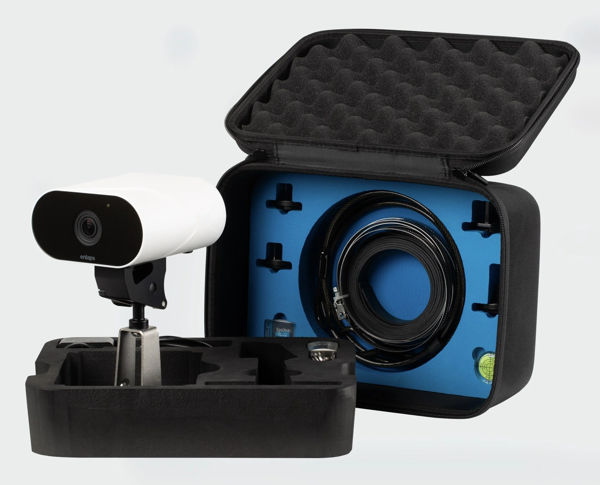
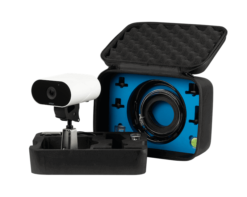
The Tikee 4’s setup process remains intuitive and aligns closely with that of the Tikee 3. After connecting via Bluetooth to the mobile app (available for both iOS and Android), users can configure their Wi-Fi or LTE settings, define the first timelapse sequence, or take test shots to ensure optimal framing. The Tikee 4 can be mounted on a standard tripod or secured with Enlaps’ metal arm, available as part of the Tikee pack, which includes additional accessories like an SD card, charging cable, lock, and carrying case.
MyTikee Cloud Platform
As with previous models, the Tikee 4 integrates fully with the Enlaps MyTikee cloud platform, enhancing the overall experience. MyTikee offers users comprehensive management of the camera, and handling of extensive image collections. Key features include organizing, sorting, and filtering thousands of images based on specific criteria like weather conditions, and generating videos with automated exposure adjustments to balance images captured across different times of the day or under varying lighting conditions. Image stabilization, exposure correction, and interval adjustments are all managed with a very simple interface, providing even beginners with high-quality, cohesive video outputs directly from the platform.
The platform is optional – you can save images only on the SD card and configure Tikee using the app, or you can use the limited free version of the platform. Personally, I find the MyTikee platform worth the investment. I understand if someone feels, “I’ve spent a lot on the hardware; I don’t want to pay monthly for software as well.” But the simplicity with which you can manage, sort, and filter tens of thousands of images on the cloud platform, like selecting only sunny days with a single click, and creating a video where exposure is automatically balanced across different times and days, is extremely difficult to find elsewhere.
Comparison of standard unedited video and the automated output of the myTikee platform.
There might be other ways to achieve this outcome, and maybe even without subscriptions or possibly even free software (I don’t know of any), but it’s going to be much more effort, there is no doubt. The simplicity and quality of the output of the integrated Tikee and MyTikee platform solution is really hard to replicate.
Summary
All in all, the Tikee 4 is a solid upgrade, enhancing several camera functions and addressing some of my critiques with the Tikee 3. Some areas that could still use improvement: it would be nice to find a way to protect the lens better from dust and rain, and, as a photographer, I sometimes wish for more control over the Tikee’s exposure settings. It currently handles everything automatically, and it does it well, but occasionally, more flexibility with shutter speed, ISO, etc., would be nice. This could be a feature for advanced users in the future. In terms of software, more flexibility in MyTikee subscription options would also be welcome – for example, to facilitate short-term timelapses at a lower cost, or a different type of subscription for sporadic use. Additionally, I’d appreciate – as with the Tikee 3 and Tikee Mini – the ability to configure multiple timelapse sequences in parallel, so I can switch between them as needed, such as a long-term sequence and a short interval sequence.
The Tikee 4 is currently available for €1,590 or in a package with the arm and other accessories for €2,298, both prices excluding VAT. With the code FLOENLAPS50, you’ll get a discount, so be sure to use it if you’re considering buying the Tikee.
In summary, the Tikee ecosystem remains perhaps the best solution for long-term timelapse. You can piece together something similar with other products and software, potentially for less money, but achieving the same results with the same simplicity and reliability is really challenging, if not impossible, and I believe the Tikee remains the best option on the market.
Enlaps Tikee Mini - A New Long-Term Timelapse Camera
My thoughts on the new Tikee Mini long term timelapse camera.
Over the years (many years in fact, my first ones were shot in 2011), I’ve enjoyed recording timelapse videos, compressing the progression of time and making resulting changes visible to the human observer.
One of my latest projects uses many different timelapse and recording techniques and combining them into a single video, documenting one of the many small Oktoberfest-like beer festivals in Germany, see below.
Last year I was contacted by Enlaps, maker of a long term imaging solution ecosystem, including timelapse projects for construction, events, nature, weather, and similar scenes that can be interesting to observe, document, and analyze many hours, days, months, or even years.
They asked me if I’d be interested in having a go at using their Tikee 3 Pro + camera, and I have been using it for 12 months on a construction project, see the video below exported straight from their platform. It did an amazing job and I never had to touch it once during the entire period - super reliable.
COUPON CODE - Get 50 EUR off of an Tikee Camera: FK-ENLAPS
The Tikee Mini
Just recently Enlaps launched a new addition to their Tikee ecosystem, the Tikee Mini, and asked me if I wanted to try it as well. Below is my video (in German, but the English subtitles are pretty good) or you can read this blog to learn what I thought of this new camera.
A Recap…
Firstly, why did they launch a new camera? Well, there were a few things about the Tikee 3 Pro Plus that were a bit overkill for some use cases. For example, for short timelapse projects where I only run the camera for a few days, I don't necessarily need the built-in solar panel. Or, depending on what I want to capture, two lenses with two sensors are simply not necessary. And these features also drive the price up, which may be justified, but depending on the application, I don't need all these functions.
It’s for this reason that Enlaps introduced a brand new Tikee camera that extends the Tikee range and generally makes long-term timelapse and project monitoring of this kind accessible to more people. It's called the Tikee Mini. Especially in comparison with the Tikee 3 Pro Plus it is indeed much more compact.
Features
This is mainly due to two reasons: it does not have a built-in solar panel, and it has only one lens with one sensor at the front. Apart from these two points, the Mini is actually very, very similar to its big brother in terms of features and even has some advantages. Firstly, it is significantly smaller and lighter, weighing less than 1 kilogram. It has a huge built-in battery with 25,000 mAh. This allows me to take pictures for up to four months at an interval of 10 minutes and send them to the cloud. It has a new ambient light sensor built in, so I can configure the camera to take pictures only at a certain ambient brightness and not in the dark. This extends the battery life even further. The whole thing comes at a much lower price than the Tikee 3 Pro Plus, namely €799 before taxes. This is, of course, a much lower than what was previously necessary to enter the Enlaps ecosystem.
Apart from that, it has many of the features of the Tikee 3 Pro Plus. To summarize: it can be used indoors or outdoors in almost all conditions with an IP66 rating. It is equipped with both WiFi and 4G LTE connection. At the back, I can insert a SIM card and also a micro-SD card with up to 1 TB of storage space so that I can record the pictures locally on the Tikee. It has a Sony sensor with 12 megapixels and the wide-angle lens at the front has a very wide diagonal with a field of view of 149° and an aperture of 2.8. It also has GPS built in, so I can locate the camera anytime, anywhere. And like the Tikee 3, it has recently been equipped with a livestream function so that I can retrieve short videos directly on the Tikee cloud platform. Thus, in terms of features, it is absolutely comparable to the Tikee 3 Pro Plus.
Setup
Setting up the camera is super easy, just like with the Tikee 3 Pro Plus. After charging, you connect via Bluetooth with your smartphone and the Tikee Remote App, which is available for iOS and Android. You configure the settings there, such as the WiFi network or the SIM card, and set up your first timelapse sequence. And that's basically it. The camera then starts taking pictures and sends them directly to the Tikee cloud, or you can, of course, save them directly on the SD card. For the installation itself, there are many options: I can simply screw the camera onto a standard tripod. Enlaps also offers its own metal arm, which I used for the Tikee 3 Pro Plus. This is available separately, but also with a Tikee Mini pack that includes various other accessories, such as the SD card, charging cable, lock, and a practical case in one package.
MyTikee Cloud
Once it is running, the Tikee Mini supports the cloud platform, just like the Tikee 3. This platform is called myTikee and offers a free basic version where I can at least use some functions and still monitor. For the more advanced functions, I need to take out a subscription. In the past, I have heard people complain about needing a subscription when they have already paid for the hardware. And yes, you can edit the photos in other timelapse software. That's all correct, and you can also simply save the photos on the SD card and then process them yourself. However, based on my almost decade-long experience with timelapse videos and several long-term timelapse projects, I can say that it is really very difficult to find a solution at the same price and, above all, with the same simplicity that can compete with MyTikee. The simplicity, such as automatic exposure correction, video stabilization, automatic selection of photos based on weekdays or weather conditions, are all things that otherwise require a lot of manual time, some experience, and software from other manufacturers, which is also not free. Therefore, I can say that depending on the application and preference, the Tikee cloud platform is worth its money. It also offers some other functions, such as monitoring and remote maintenance of the Tikee camera or the AI solution for monitoring construction projects, etc. You should definitely take a look at it and consider how you want to use the Tikee and which type of subscription makes sense.
Comparison of standard unedited video and the automated output of the myTikee platform.
A few thoughts…
Based on my initial tests and my experience and expectations of how the Mini could be used in the future, I can say that Enlaps has, I believe, achieved its goal of making long-term timelapse and project monitoring even easier, more accessible, and more affordable. I have a few small points that could be improved: I can imagine that dust and rain on the lens could be a problem, and some kind of protection would be useful here. I wish you could adjust the distortion of the wide-angle lens in the MyTikee platform. Because the perspective is close to a fisheye, you don't always get straight lines, which is important for construction sites in architecture. Apart from that, as with the Tikee 3, I would like the timelapse sequences to be more flexible, such as being able to run multiple sequences simultaneously. Hopefully, these are things that can be made possible with software updates in the future. The last point is that the Tikee is, of course, battery-powered. It has limits of, say, three to four months. You can power it with an external battery via USB-C or connect a solar panel. Enlaps offers an option for this, which is relatively large and not so cheap. This makes the whole thing a bit heavier and more expensive again, but the option exists if you have projects that require monitoring or recording for longer than, say, three months.
Summary
Even though I have a few small suggestions for improvement, I can say that the Mini is really a welcome addition to the Tikee product line. It strengthens Enlaps' position as a leading provider of an ecosystem for long-term timelapse recordings or project monitoring. There is really not much comparable. You can achieve such results by combining products from other manufacturers, software and hardware, and trying to build something yourself. This is doable, I believe, but much more complicated, less reliable in my opinion, and probably not cheaper. Thus, the camera is perfect for anyone who wants to document a project like construction work or an event for a few days or weeks in an easy and relatively affordable way, and then use it for social media, internal purposes, or for monitoring construction sites, etc.
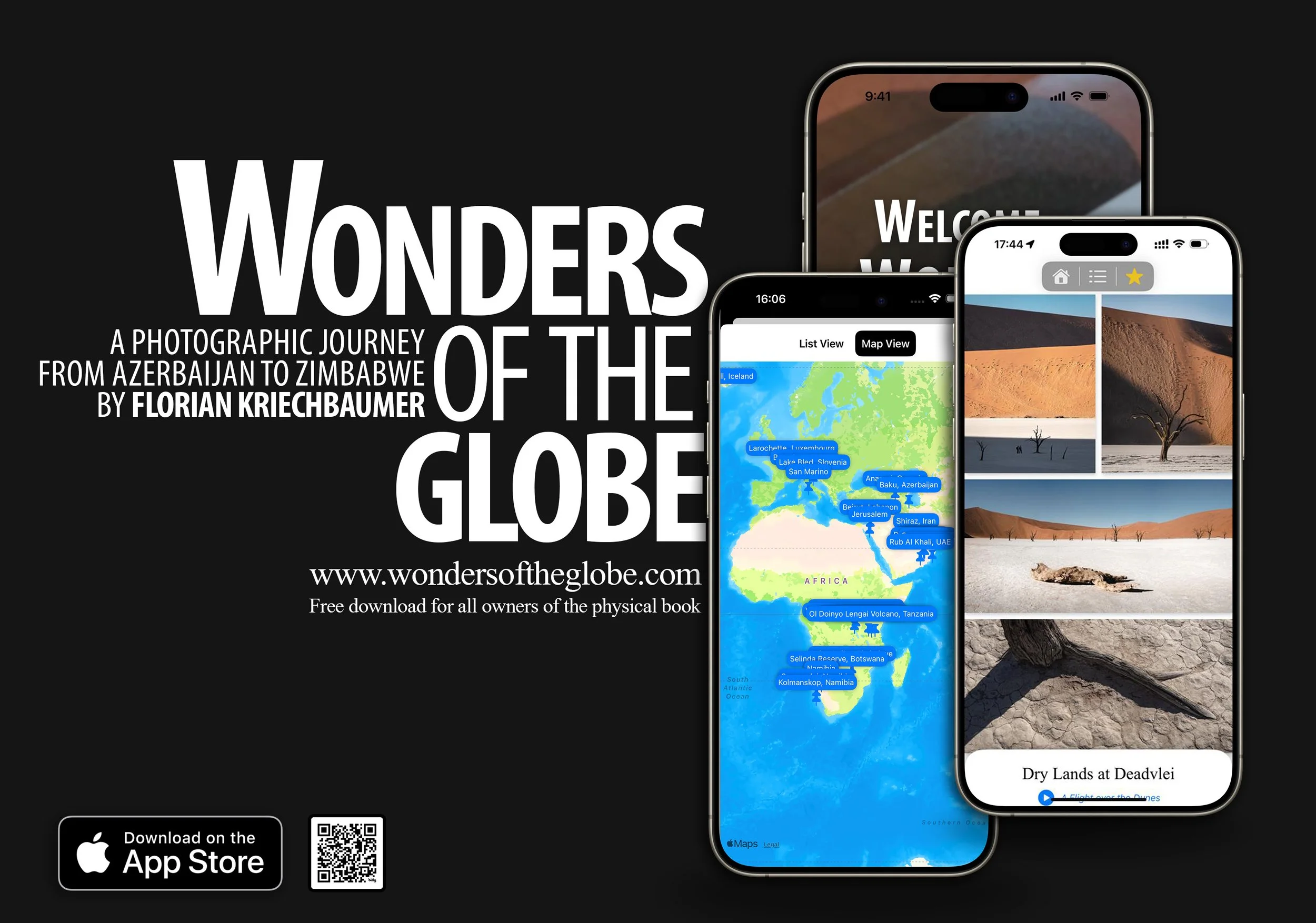
The “Wonders of the Globe” App
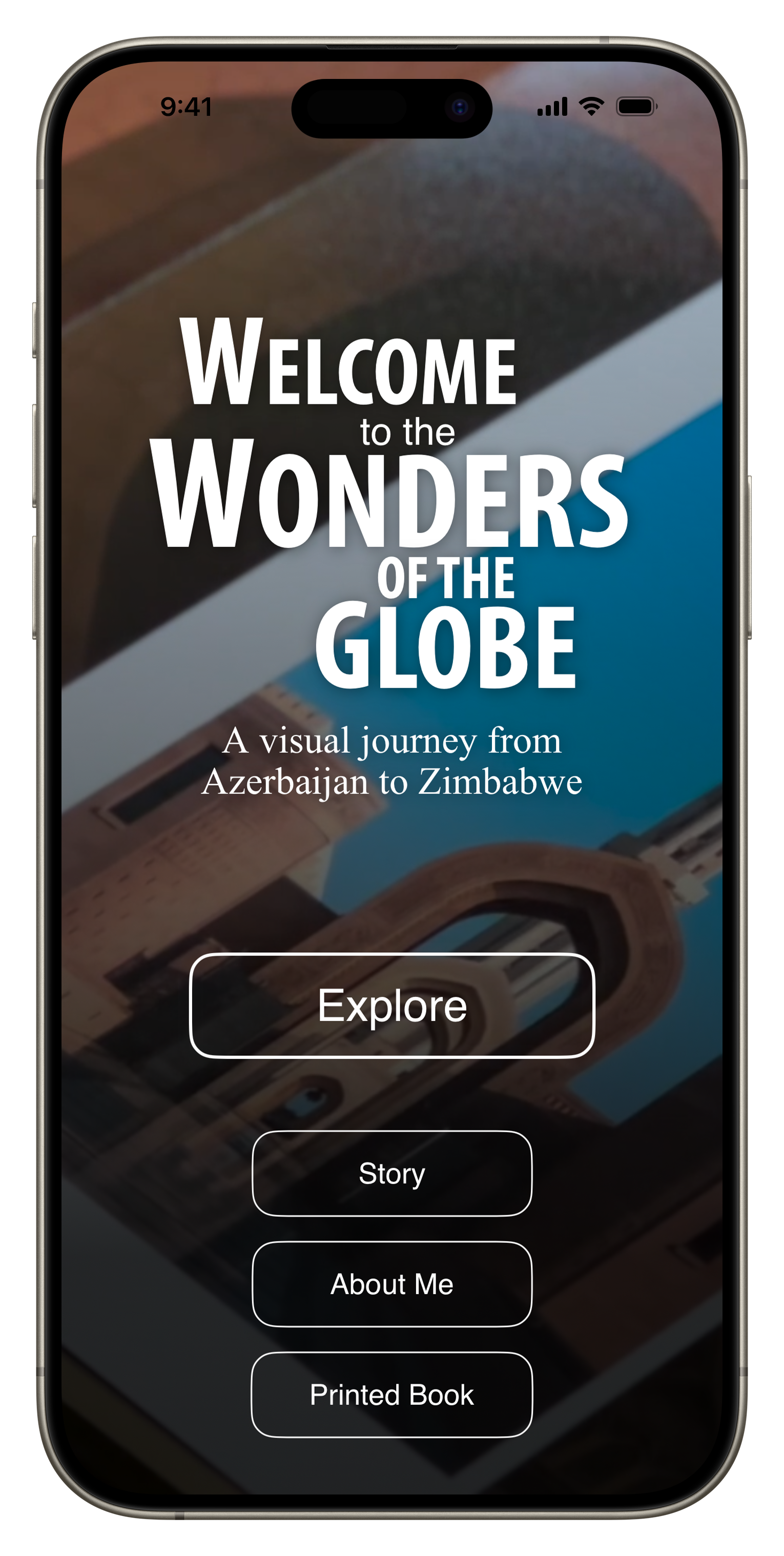
Creating a digital version of my photo book “Wonders of the Globe” as a native iOS app.
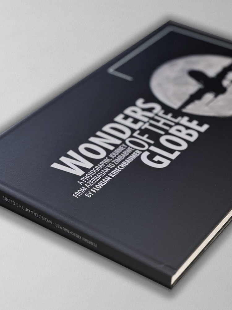
As some of you may have seen, I recently self-published a photo book called “Wonders of the Globe”, documenting some of the amazing places I had the privilege to see and photograph, and - as is often the case with my projects - just to see “what it’s like” to design, compile, write, print, and sell your own photo book.
The Book
It was an interesting experience, with quite a bit of trial and error, a few learnings, and also a look at the economic realities. I did everything in house, including building the website and ordering capability, which nowadays is pretty straight forward thanks to places like Squarespace, and Stripe (which this page is built on).
I’ve been making and selling prints for a long time and have always enjoyed seeing photography in physical form, rather than just on screens. At the same time, there are many things that a print or book just can’t represent the same way as digital art - something I’ve been toying with as part of my NFT series.
For Wonders of the Globe, creating a digital version was on the agenda from the beginning, but what exactly it would look like only evolved out of my desire to finally get my hands dirty writing code, and the fact there are now AI tools to help you make that a little easier.
For most of my “regular” career I’ve been really involved in software development, be it apps for hospitality, or energy management systems for buildings, always managing or working closely with engineers. That gave me a lot of insight into everything from UI and UX designs, databases, App stores, embedded development, architecture for cloud platforms, etc, and I’ve picked up a fair bit of knowledge in the process.
But I always had the urge to start creating a piece of software from scratch myself (aside from making a few websites) and this was the opportunity to do just that. Having been a follower of Apple and user of their products for a long time, the only real option for me was to start with their platform, and getting to know Swift UI, the latest programming language for its products (and one of the easier ones out there, also thanks to Apple’s ecosystem).
Main Goals
My primary idea behind creating a digital version included the following:
Be able to update the content regularly, so that owners of the physical copy can also get access to new photos
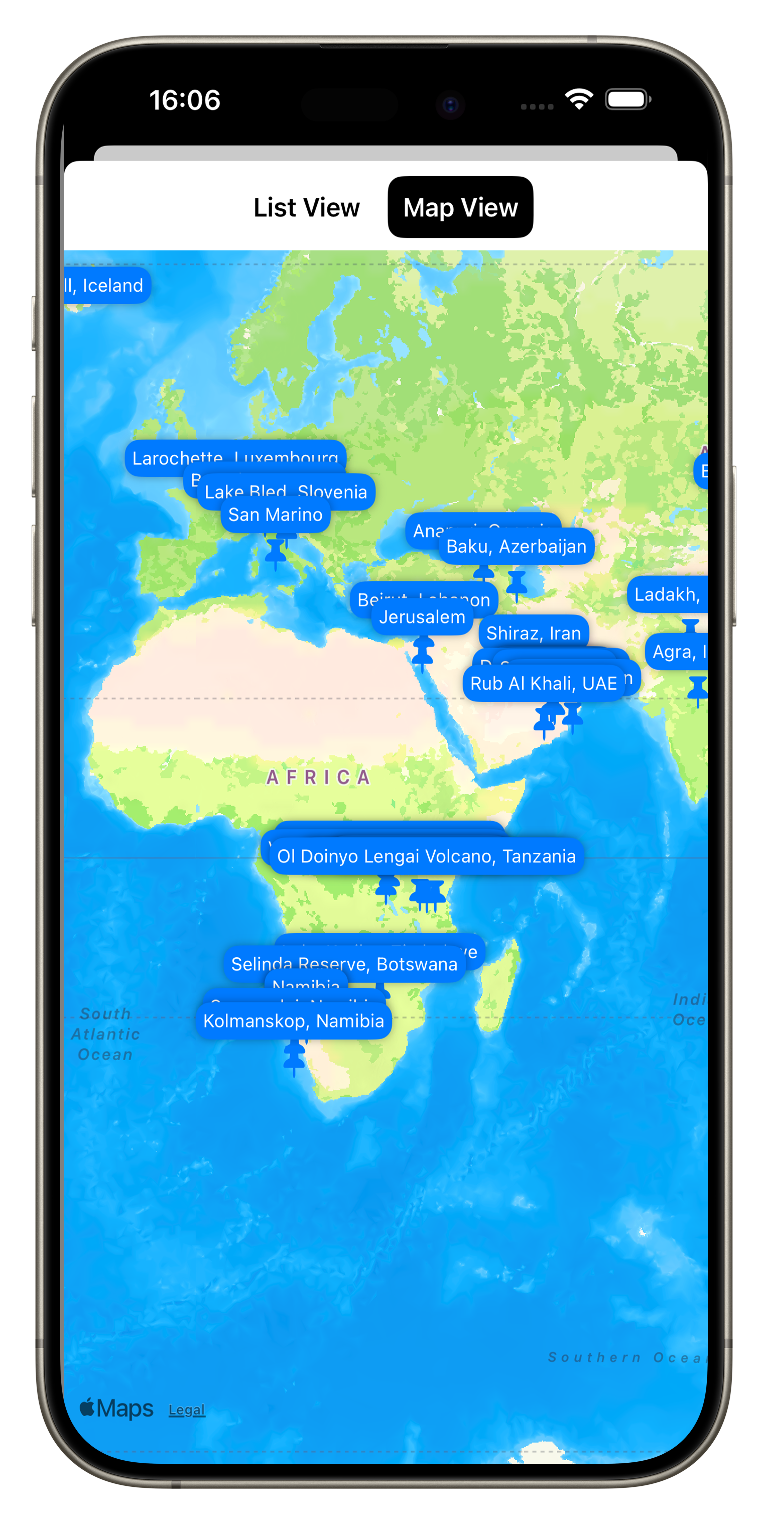
Include some interactive features like Maps for each spot, and a table of contents
Be able to link to relevant blog entries for some of the photos
Add some behind the scenes and supporting videos
Make it work on iPhone, iPad, Mac, and the Apple Vision Pro
For the App to work offline
The Journey
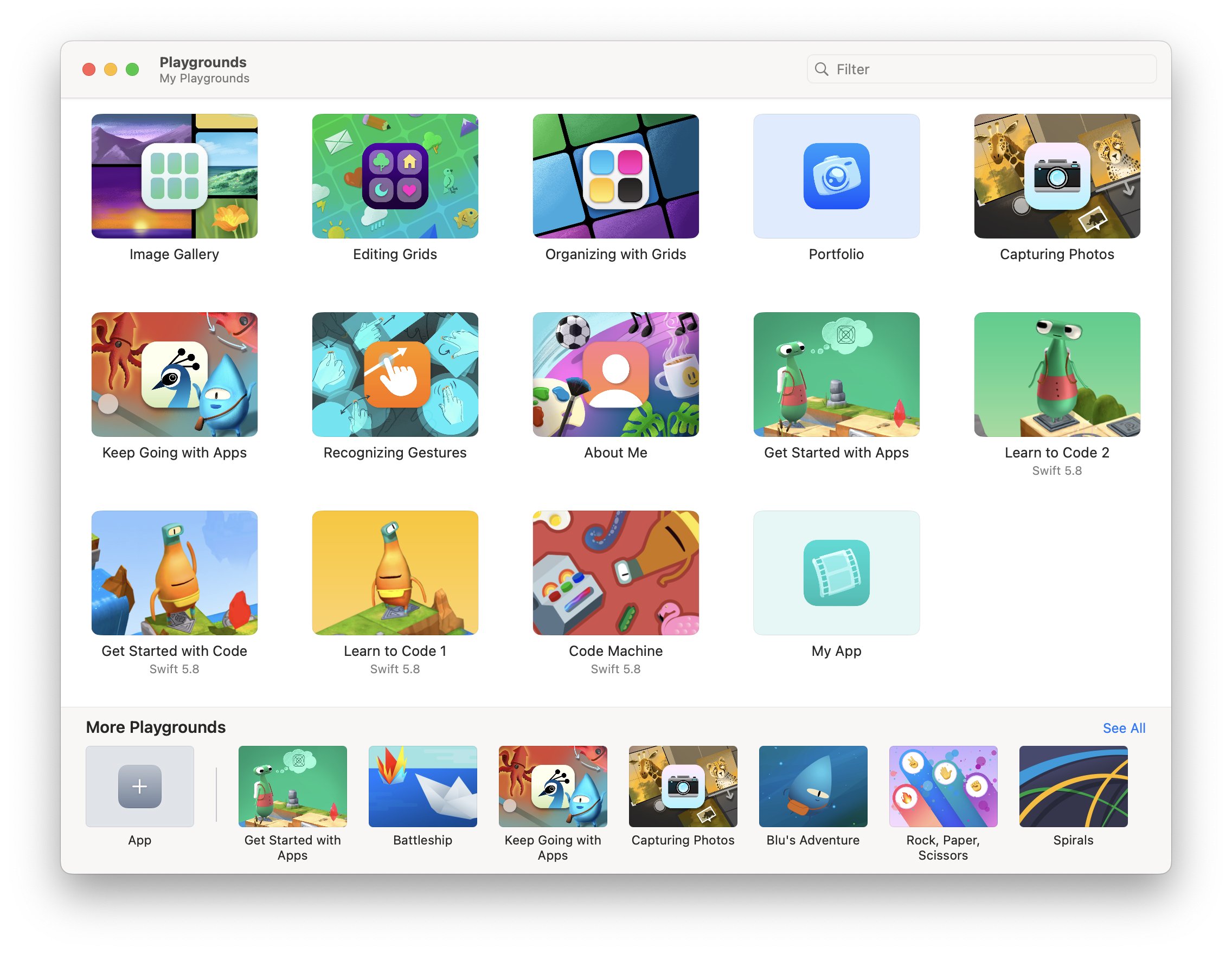
So in October 2023 I started teaching myself Swift UI using Apple’s Swift Playground App, a simple playful way to learn basic concepts on business logic and layout. It also includes a few examples on building grids and image-based layouts, which was very helpful.
From there, I soon moved over to Xcode, Apple’s integrated development environment, and started building the structure of the app. My goal was to build a completely native app, not using any third party tools.
The basic structure of the app was built relatively quickly, including a homepage, some supplementary pages, and the main book section. Over time I added a map view, table of content function, and a favorite function for the user to mark and recall interesting pages quickly.
My past experience came in handy in designing a scalable, flexible, and maintainable system that would allow me to manage the book content in one place (I chose a simple JSON file) and minimizing the number of layouts for individual “pages” of the book. I built generic layout views depending on the number of images on each page and their aspect ratio (I ended up with 11 for 54 pages, which probably could have been reduced further with some optimization), and rendered all other common elements such as the buttons and text overlay separately.
A few things that stood out to me: It was quite simple to add basic animations and effects such as blurs and backgrounds to create a bit more visual interest. A lot of built in tools like navigation links, sheets, and tab views simplify creating the main structural elements and views significantly.
On the other hand, there were several things that proved to be more of a headache than I anticipated, for example managing performance of image loading and thumbnails, and particularly gestures for zooming, panning, swiping, and their interaction / conflicts - this took way more time than I had expected, just to replicate what the built in Photos app can do. Making simple image layouts that scale and resize nicely was also more challenging than on many common web platforms. There are still a few aspects in the app around these features that are not ideal.
The biggest initial hurdle for me was understanding how to build the data model out of the JSON file, i.e. the piece of code that holds all the book information and images, and can be accessed and updated by different parts of the app. Once that was figured out though, it became quite easy to add new pieces and create a flexible infrastructure.
AI Help
ChatGTP also proved to be incredibly helpful in fixing issues or suggesting minor improvements to my code. As of December 2023, version 3.5 often produced more helpful output than ChatGTP 4 for specific code level requests, while generic questions produced better answers with version 4, partly owing to its more recent training data set.
While it was 100% necessary to have an understanding of the architecture, code, best practices, and an overall vision of the app, it definitely saved me dozens of hours in debugging and researching certain features of the programming language.
A draft version of the App was finished in early January, when I asked a few friends to beta test them using Apple’s TestFlight App (a simple way to get feedback and allow others to access your app without making it public). I also used the Xcode simulator to run it on older devices and different screen sizes, including iPad and Mac, to see how the layouts would work.
I fixed a few minor issues and submitted the app to the AppStore shortly after, just needing to add promotional text, screenshots, privacy policy and manage some administrative aspects, plus setting the price. As my main goal was to create the app as a companion for the physical book, I chose to make it free for owners of the book, and have everyone else who wants it pay $2.99 - whether anyone will do so remains to be seen, but art should have value.
After an initial rejection based on rule 4.2 (the app should serve a purpose that is more advanced than a simple website), I explained to App review some of the features of the app that cannot be replicated on a website easily (favorite function, offline caching, etc), and they accepted the next revision.
As a result, the app is now live on the App Store - tap on the image above to see and download it. If you’re an owner of Wonders of the Globe, you should receive a code that enables a free download, if not, please contact me.
While this is a first version of the app and it is admittedly quite simple, I have a few more features in mind for upcoming releases:
Landscape mode support (for now the App works only in Portrait orientation)
A better layout for iPad and larger screens (I really want to test it on Apple Vision Pro as well)
A home screen widget with a random new photo from the portfolio every day
Being able to add new content without needing a new version of the app (this will require me to build a server side interface, let’s see if that’s something I want to tackle!)
For now, it’s been a nice project the hopefully brings some enjoyment to a few of you.
Subscribe to my newsletter to get notified and don’t miss out on more Wonders of the Globe.
Other Recent Posts:
Enlaps Tikee 3 - Long Term Imaging Solution for Projects & Timelapse
My thoughts on the Tikee 3 Pro + long term imaging and Timelapse solution.
Over the years (many years in fact, my first ones were shot in 2011), I’ve enjoyed recording timelapse videos, compressing the progression of time and making resulting changes visible to the human observer.
One of my latest projects uses many different timelapse and recording techniques and combining them into a single video, documenting one of the many small Oktoberfest-like beer festivals in Germany, see below.
A few ago I was contacted by Enlaps, maker of a long term imaging solution ecosystem, including timelapse projects for construction, events, nature, weather, and similar scenes that can be interesting to observe, document, and analyze many hours, days, months, or even years.
They asked me if I’d be interested in having a go at using their camera and creating a small review. How could I say no to trying some new technology? See below the resulting (German with English subtitles) video, or read on for the English review.
COUPON CODE - Get 50 EUR off of an Tikee Camera: FK-ENLAPS
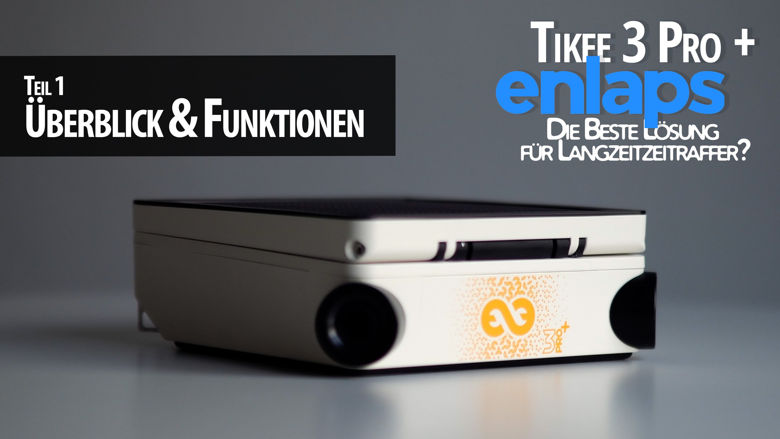
Enlaps Tikee 3 Pro +
The product it's all about is a time-lapse camera called the Tikee 3 Pro +, which is the version I got from Enlaps. And this is a product that I find quite exciting, and would have liked to have had it myself a few years ago.
It didn't exist then, or rather I didn't know that the first versions already existed, so when Enlaps offered me this camera to test, I was immediately interested.
The Tikee is a time-lapse camera that can record all kinds of time-lapses, but is primarily designed for longer time-lapses, for example outdoors. That's a good thing, because my parents are currently building a new house here in Germany, and I intend to install the Tikee there on the construction site as well, to be able to test it in real life in a real operation.
Features & Cost
First, let's take a closer look at the camera - Enlaps provided me with a Tikee 3 Pro+, which is the more feature-rich and also slightly more expensive of the two available variations. The difference is particularly evident in the flexibility of the recording modes, more on that later, the exterior and the general principle of the two cameras as well as the quality is more or less identical.
The camera in this version costs 1800 euros. Also, Enlaps sent me a stainless steel mounting arm, which normally costs 180 EUR, and a mounting kit for 42 EUR. There are other useful accessories, such as an anti-theft chain and lens protectors, which I think would be particularly useful in the field.
Where we are on the subject of costs, the Tikee is available with a cloud platform. There's a free version, but the really interesting stuff starts at €59 per month per camera, or €35 per month if you buy a full year. More expensive variants for enterprise functions, such as access management and automatic person blurring can also be very useful, but are not absolutely necessary for everyone.
At first you might think that 1800 EUR plus accessories and monthly software costs is quite a handsome price, but that always depends on what you want to achieve and what you compare the whole thing to.
Personally, I don't know of any comparable product that seems so sophisticated in this simplicity, but let's take a closer look at why I think that: The Tikee itself is quite small and light, weighing less than 2kg, 20 square centimeters in size and 7cm high.
And it has some exciting built-in features: First of all, it has 2 built-in lenses with an aperture of 2.8 and a sensor of 16 MP each. This gives wide-angle panorama shots with a viewing angle of 220 degrees and a resolution of 6k.
The viewing angles of the two lenses will also be merged automatically, which means you don't have to do it manually, which can get really annoying. I've tried this before ;) With a resolution of 6k you can zoom and pan in the viewing angle and still have acceptable quality. In addition, the Tikee has a built-in directional solar panel that you can fold up and rotate and swivel here, and powers the built-in battery so that you can record your time-lapse in almost all configurations independent of a power source. Appropriately, it is also connected to the Internet either with WiFi or 4G LTE, which means you don’t necessarily need a wired Internet connection to load the pictures onto the cloud platform. The exception to this is DNG format images, if you want to use them to get more dynamic range and edit the images manually you have to save them internally and then download them from the camera, only JPGs are sent to the cloud.
On the back we find an SD card slot next to the SIM card, a power button and a manual trigger, as well as an input for an additional solar panel and a USB port that can also be used for charging. In addition, a fastening ring for the anti-theft device, as well as the possibility of screwing on the underside. The camera is IP66 ratedand also has built in GPS so you always know where it is even when you are out in the field.
MyTikee Cloud
On the myTikee Web Platform, you can view and configure the data from your Tikee camera, as well as create and group portfolios of multiple Tikees. By the way, there is also the possibility to add a normal IP camera, of course not with all the functions that the Tikee offers, but that can still be useful. If you want to generate timelapse videos, there is of course the option to only select certain days or times, such as only weekdays or working hours, but also functions with artificial intelligence, such as automatic selection of only sunny days.
Of course, this can be very exciting for long-term recordings, where you don't want to have the switch between sun and clouds all the time. The system also generates a kind of best of list of selected videos and photos of the best scenes or weather conditions, which lend themselves to further editing and direct sharing without much effort.
There are also somewhat more advanced functions such as a “before \ after” split image, i.e. different periods of time on the left and right of the image or automatic fade between different periods of time. usable eg for building site progress or winter/summer, good/bad weather, etc. For commercial purposes there is also the blur people or certain areas function to guarantee data protection. Since recently there are also AI-supported analysis functions such as recognizing people and counting them, and automatic recognition of construction equipment, vehicles, which can then be visualized etc.
The link to the feed can be shared privately and publicly and also in your own / others websites are integrated, as well as exported with up to 6k for further processing. Incidentally, the web app will soon also be available in German, says Enlaps, currently it is in English and French.
Summary
All in all, as far as I can tell, the Tikee is a very mature product, which is aimed at quite specific areas of application, but thanks to some flexibility it can be used very widely. Comparable results and functions for a similar price are difficult to find, or involve a lot of personal effort and handicraft work, even in post-processing. Of course, such options offer more flexibility, e.g. to choose a focal length, etc., but never the same simplicity and possibly more costs.
If you are looking for a camera that is easy to install and use to document projects such as construction site time-lapse, weather and wave conditions on the beach, snow in the mountains, setting up events, etc., I think you are in the right place. Little infrastructure requirements due to the built-in solar panel, battery and 4G LTE make it very easy.
If I had to criticize a few points, I would probably say that the camera delivers night shots of acceptable quality, but of course it is not suitable for things like the Milky Way etc. A small personal annoyance for me is the USB connection, which is a micro USB - most of my products have already been converted to USB-C and the extra cable is sometimes annoying, but not so dramatic as you rarely have to connect to the Tikee.
A theoretical problem that I could still see is that the lenses fog up when shooting in high humidity or frost. Some external solution with a kind of heating sleeve controlled by the Tikee, for example 10 minutes before the start of the recording, could be desirable. Of course, this has consequences for battery life, one would have to consider that.
Nevertheless, in my opinion, Enlaps has built a very exciting product that enables new recording scenarios and, above all, makes long-term time-lapse easier and more accessible. The many interesting aspects of the mytikee platform also make me positive that a lot of functions are still being developed here, so the options for data analysis are of course endless.
In any case, I am very positively impressed. If you have any questions, please leave them in the comments, I will definitely create more videos in the next few weeks, particularly on setting up and configuring the Tikee.
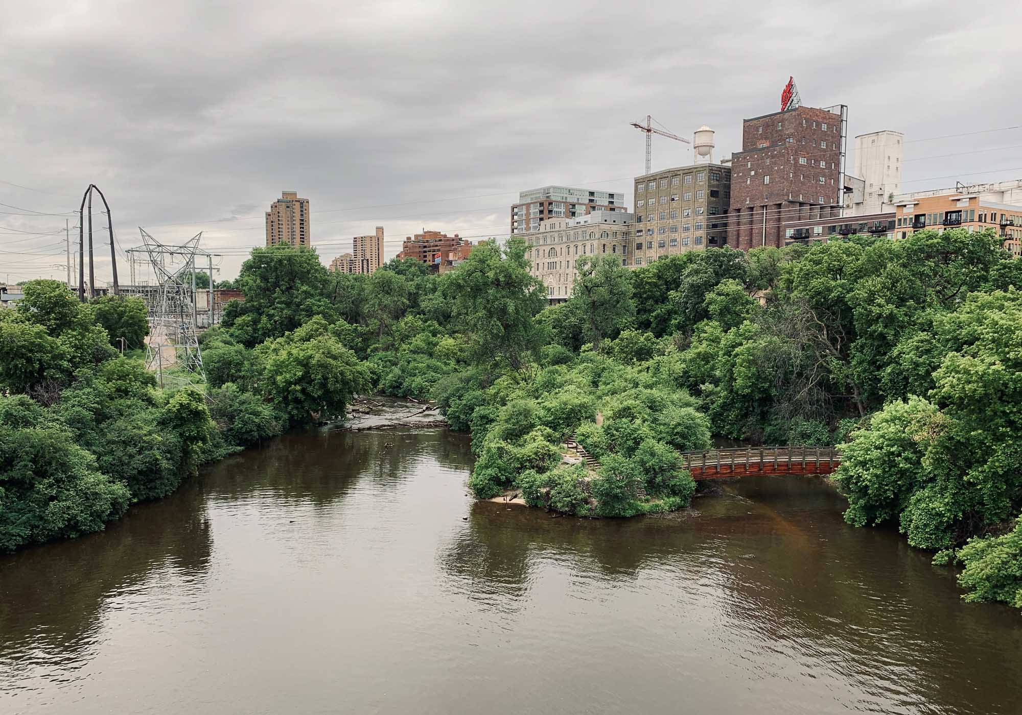
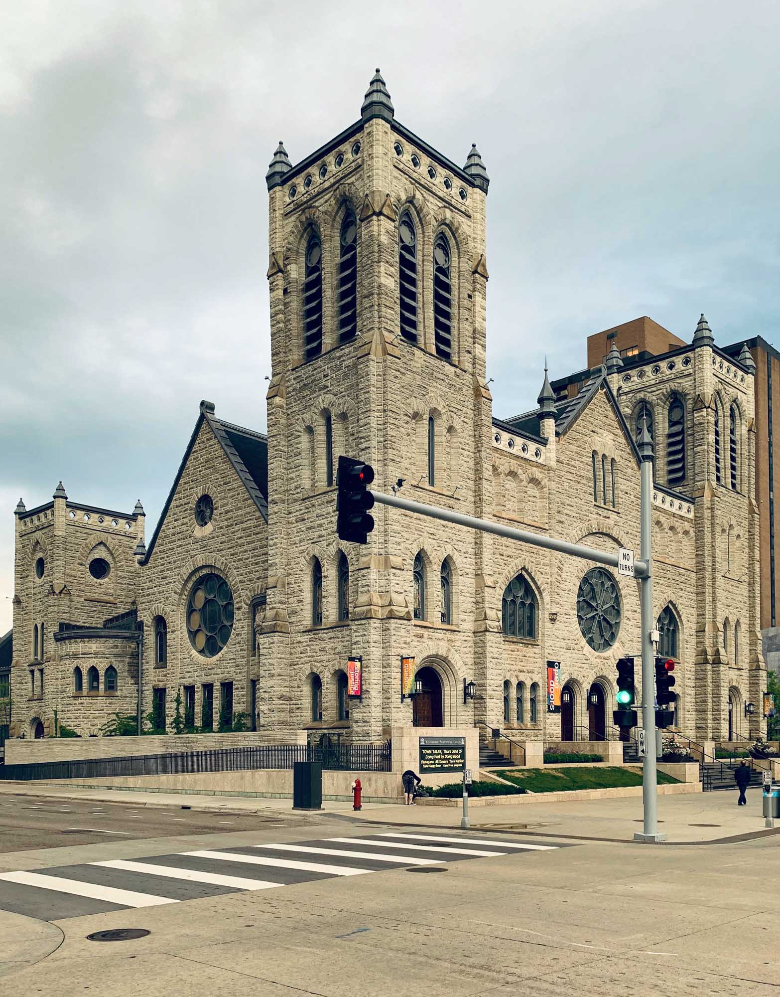
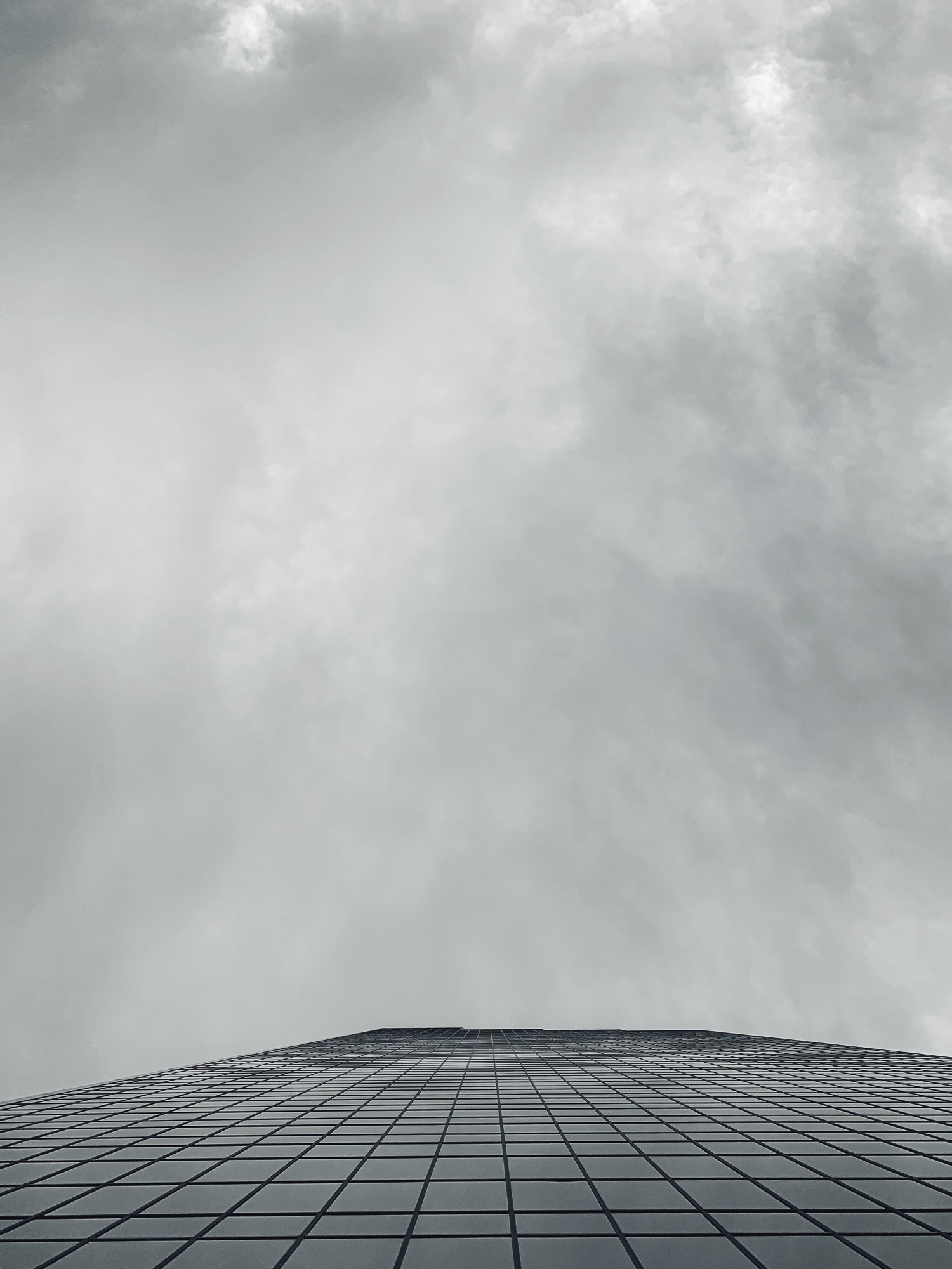
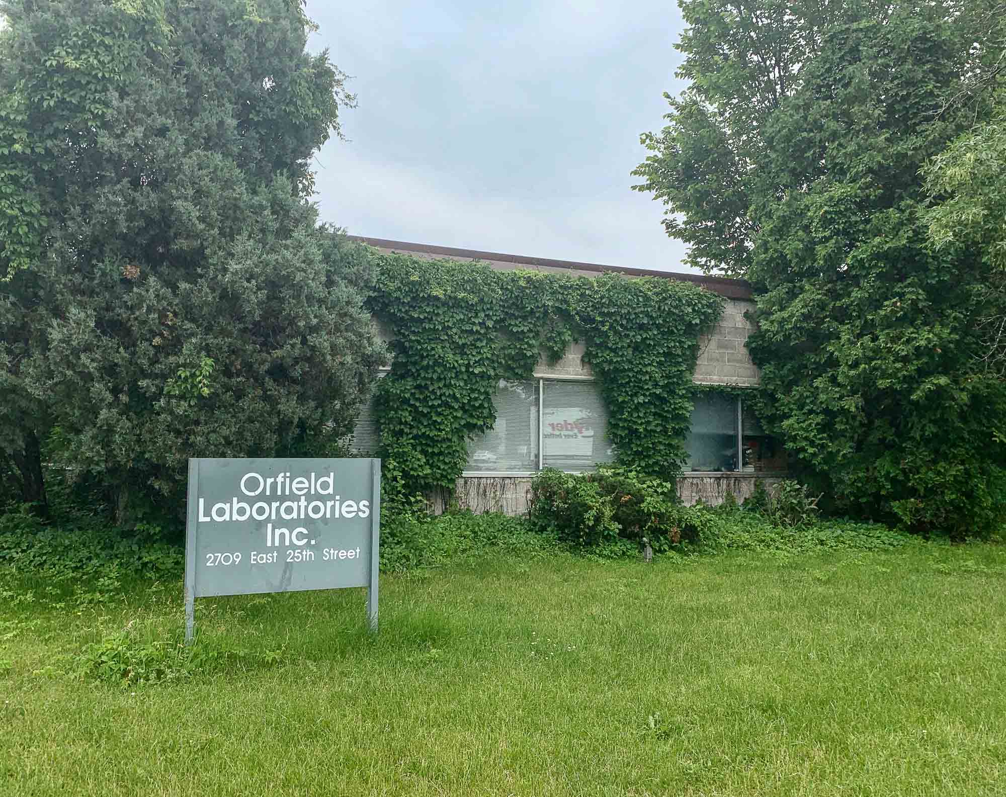
Minneapolis & "The Quietest Place on Earth"
The yearly trip to HITEC - the world’s largest hospitality technology show - this year brought me to Minneapolis, MN, in the United States.
Since I’m always up for exploring a new place, I couldn’t resist to stay an extra day to make the 26h trip from Dubai a little more worthwhile - and it definitely was!
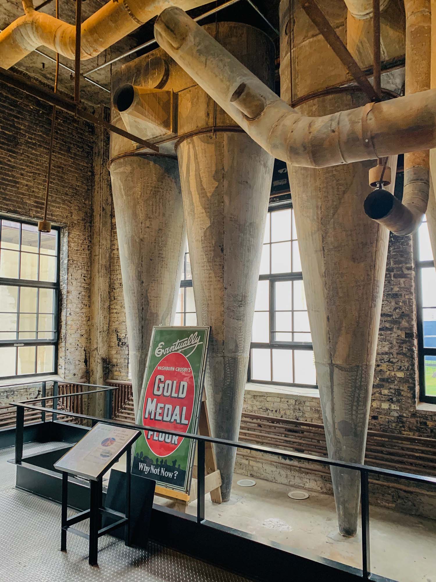
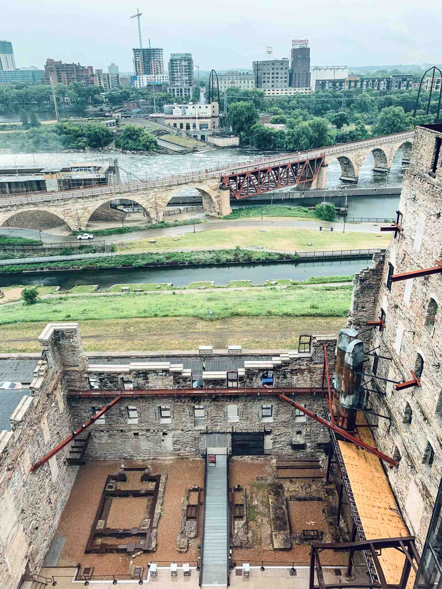
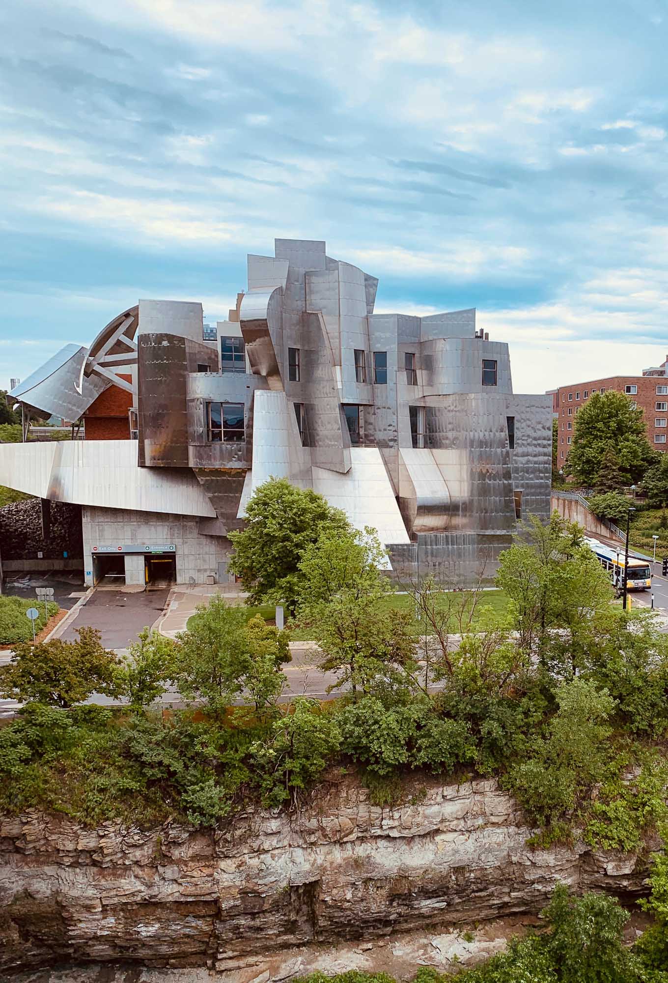
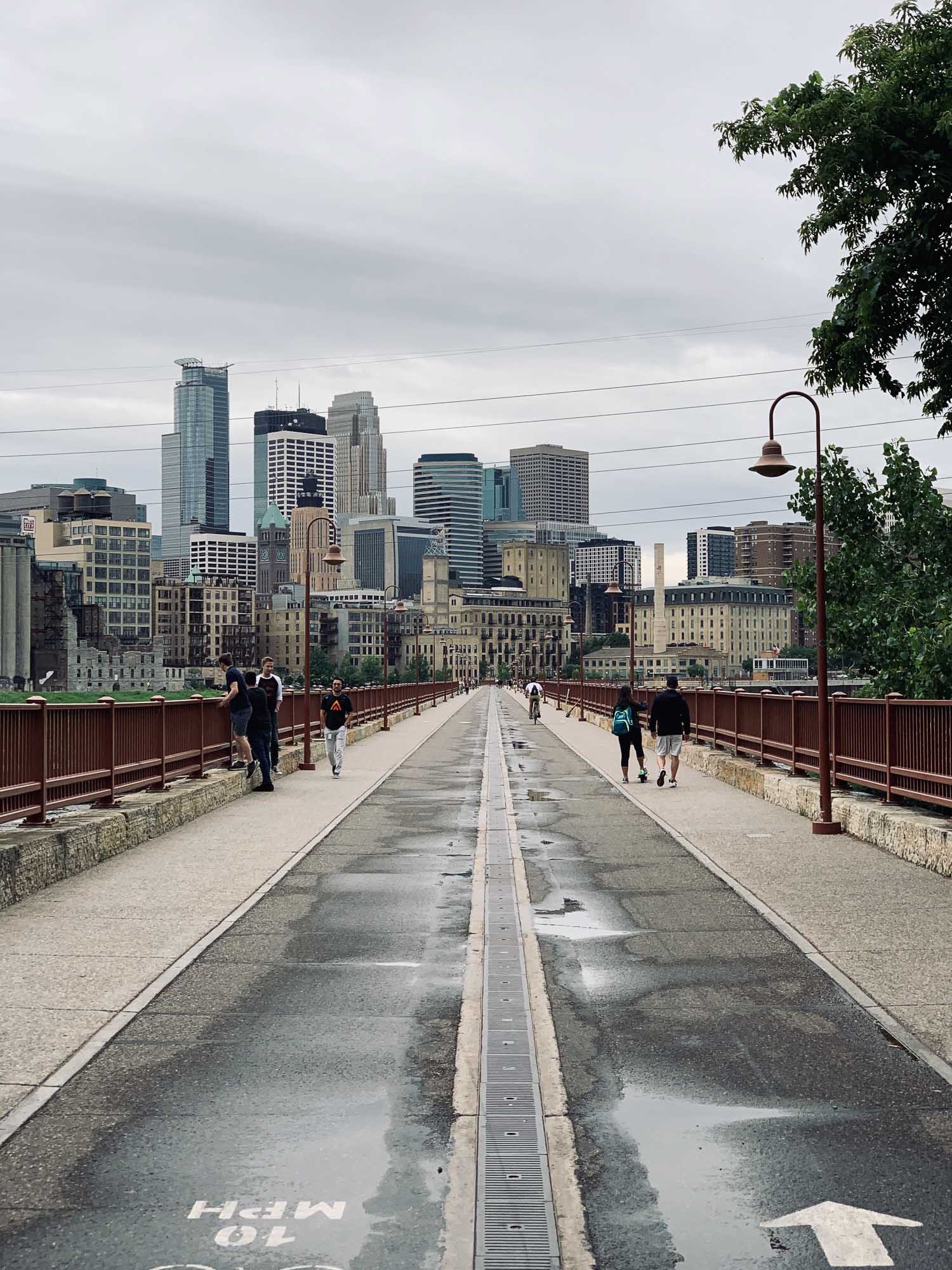
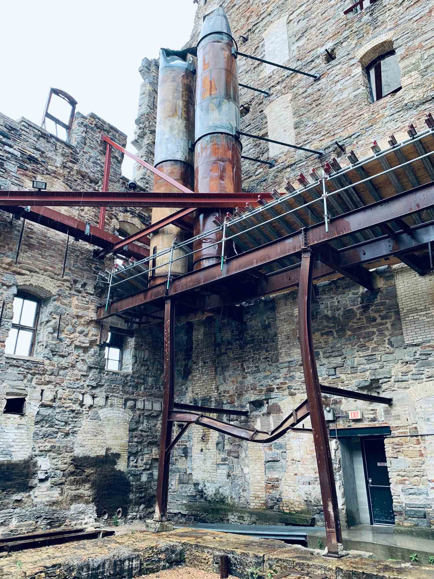
Minneapolis has a rich history as the milling capital of the US, owing to the Mississippi River running through the city, and is home to a few interesting sights.
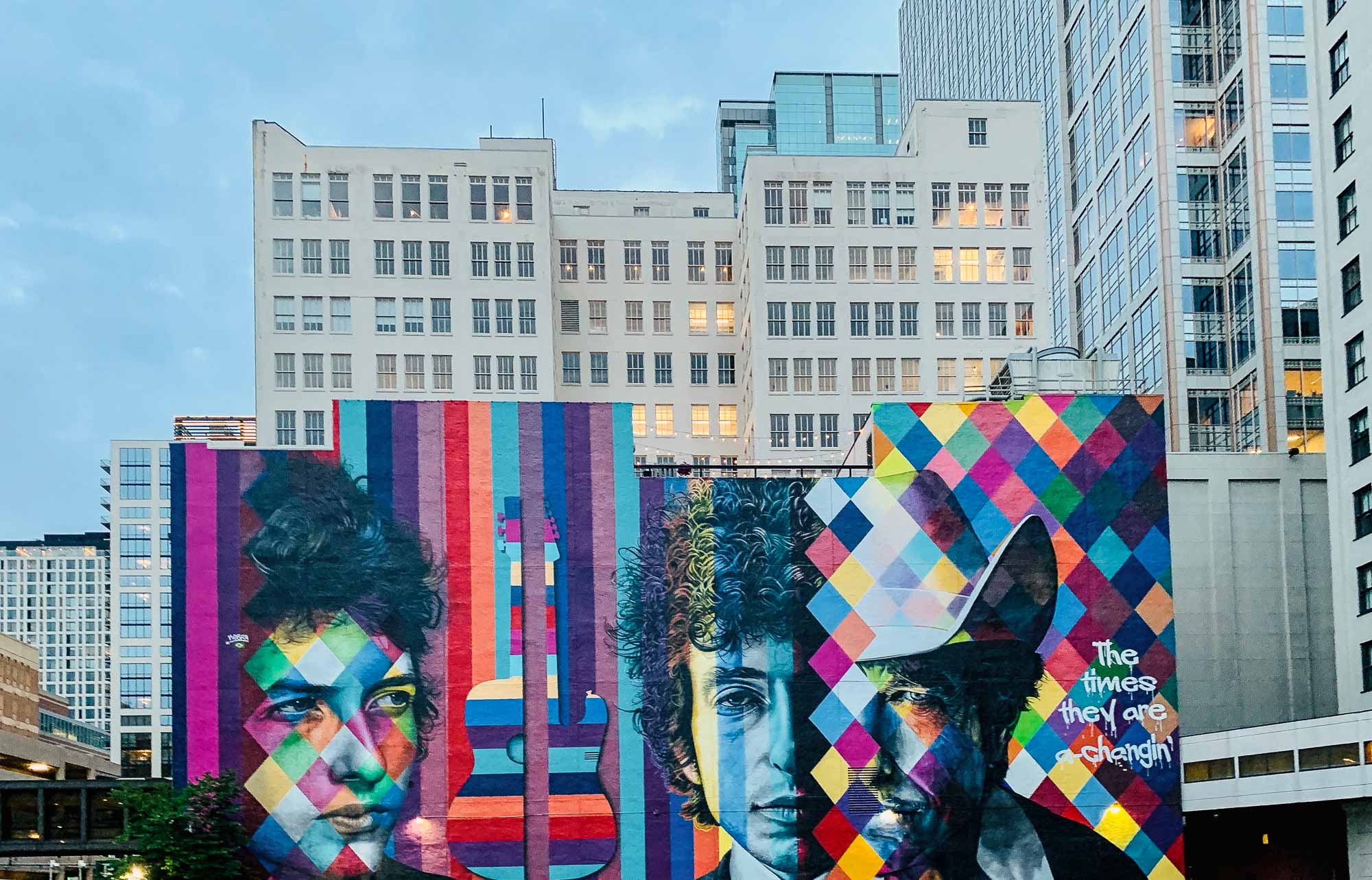
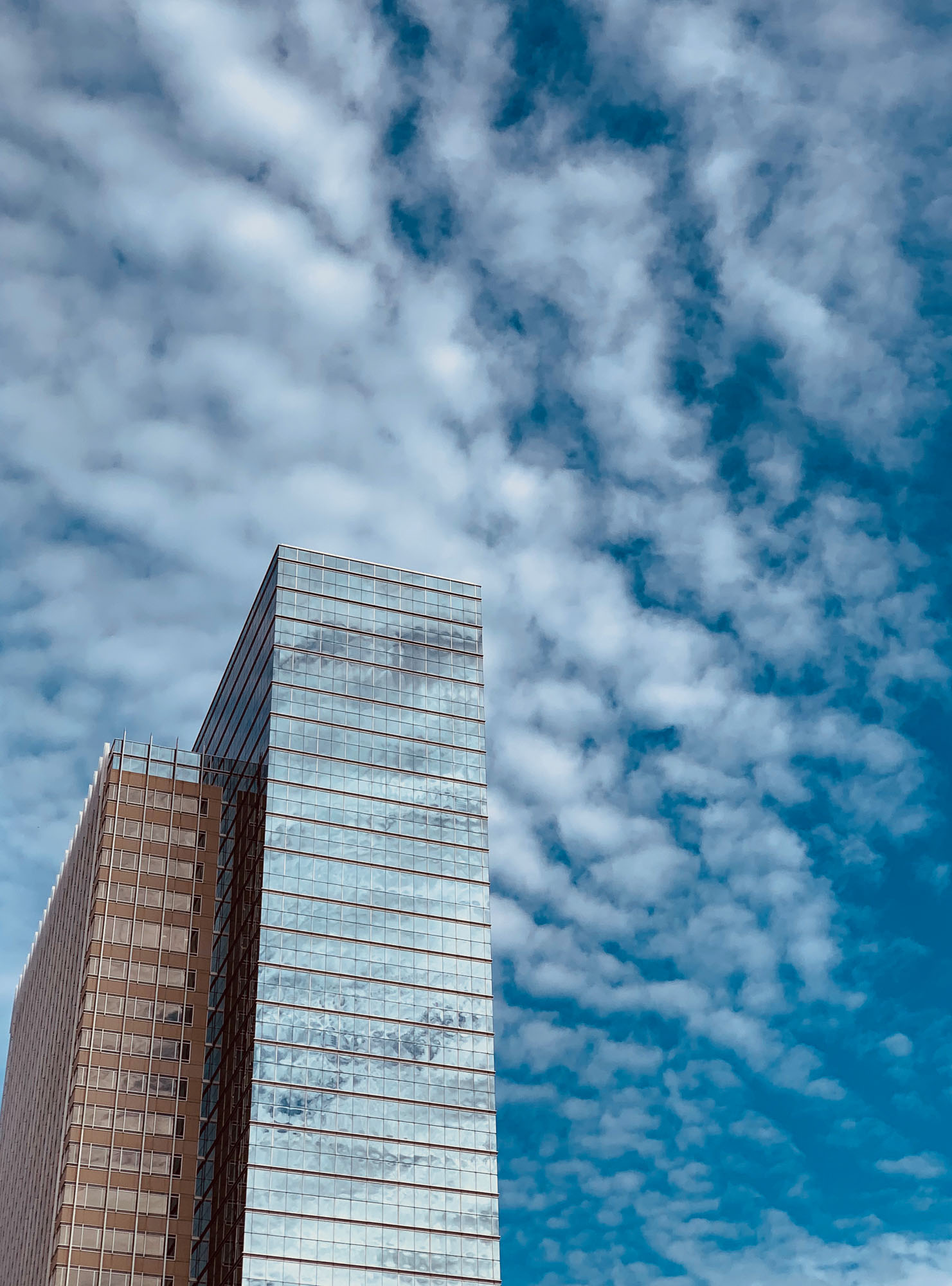
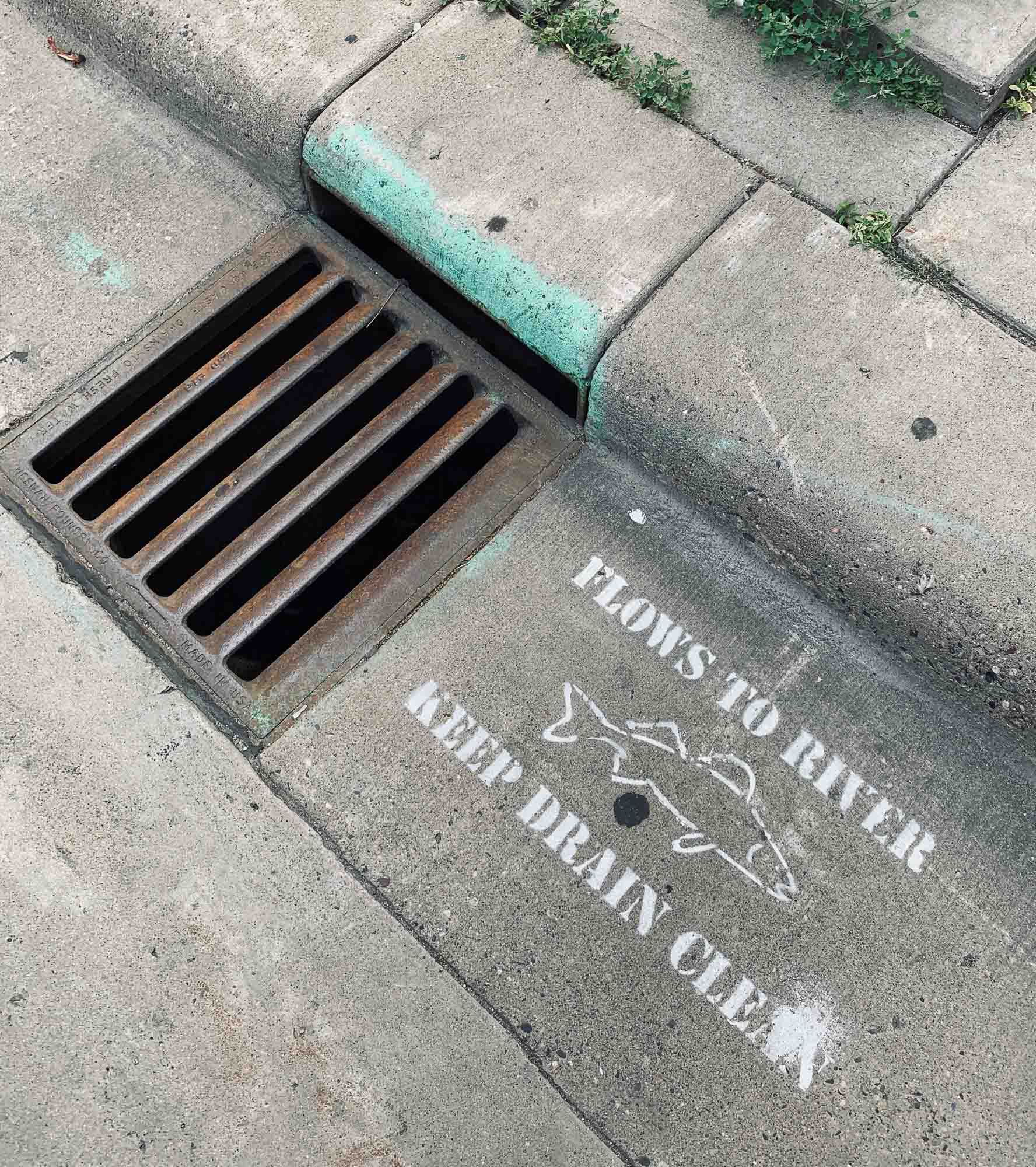
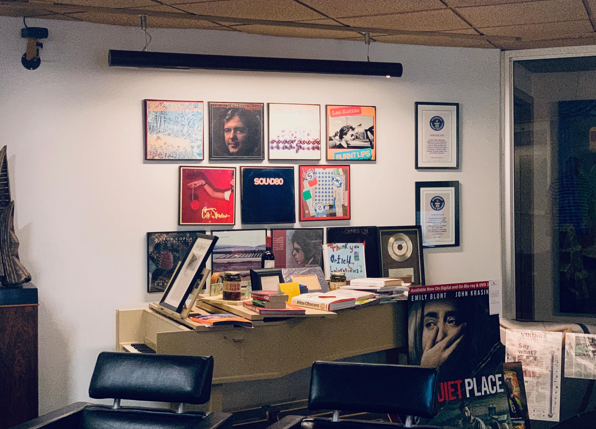
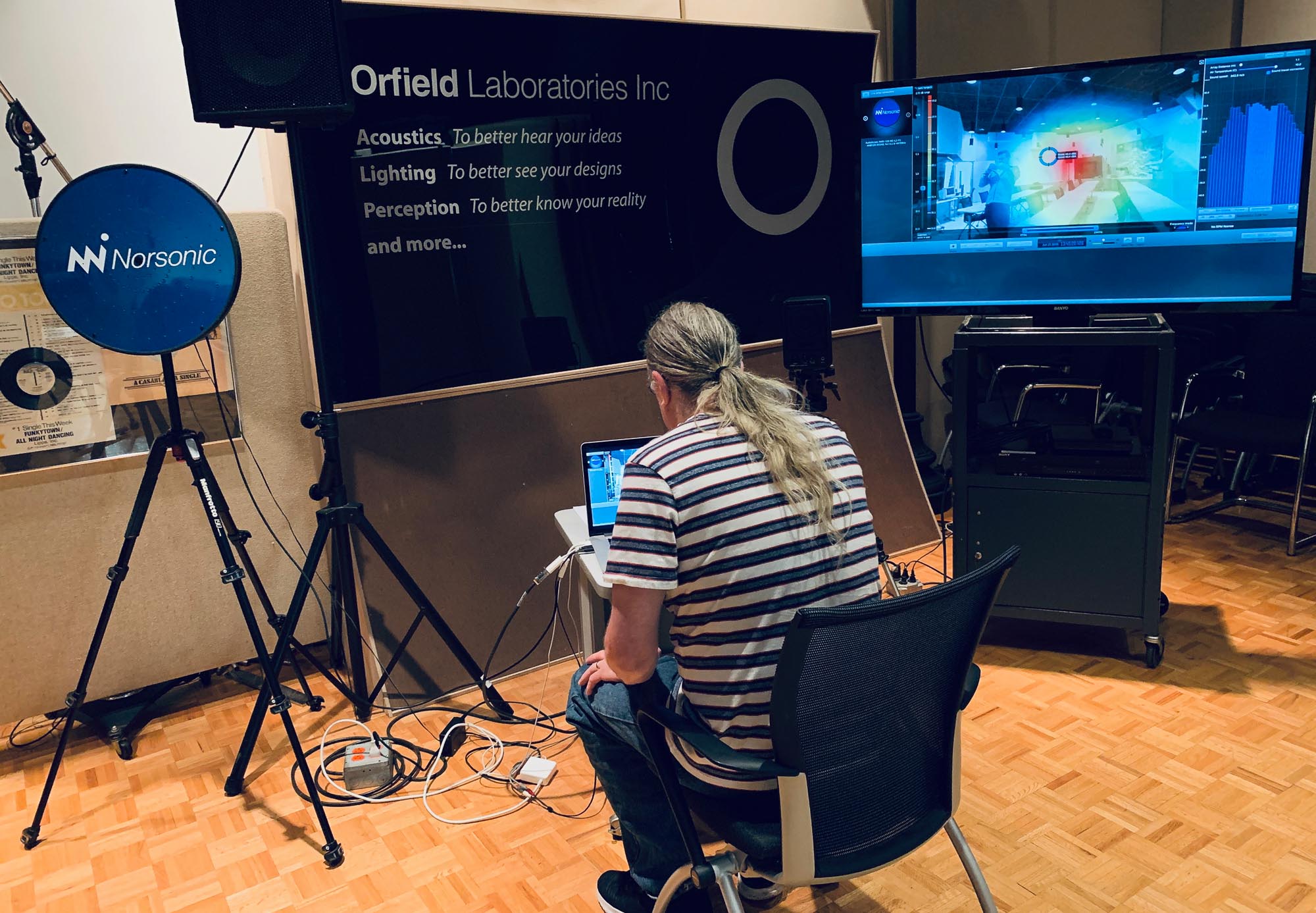
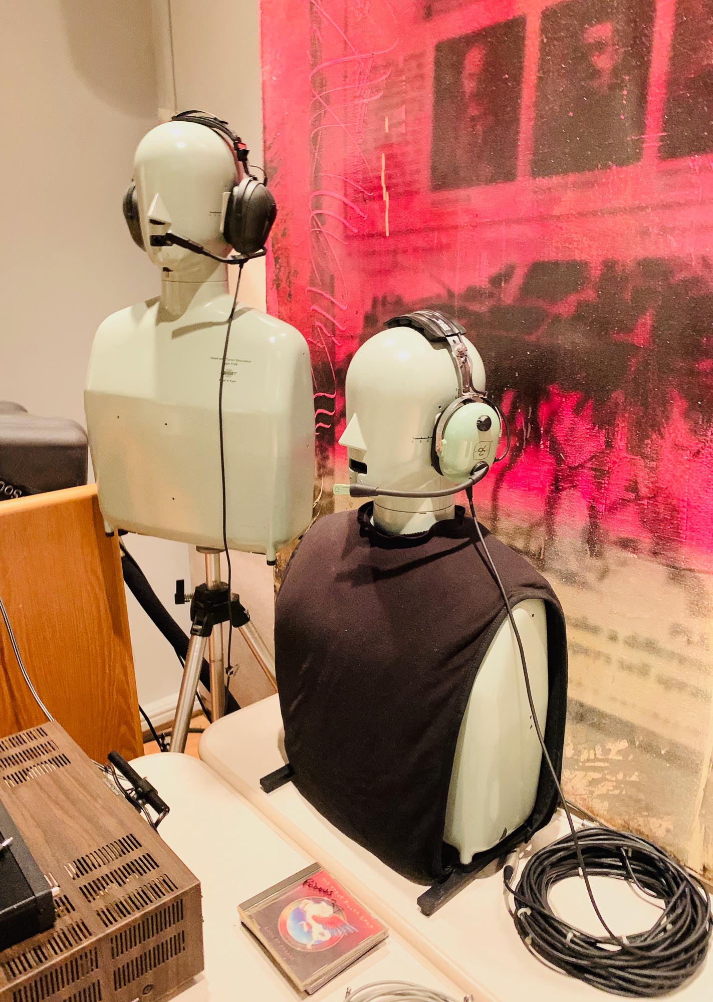
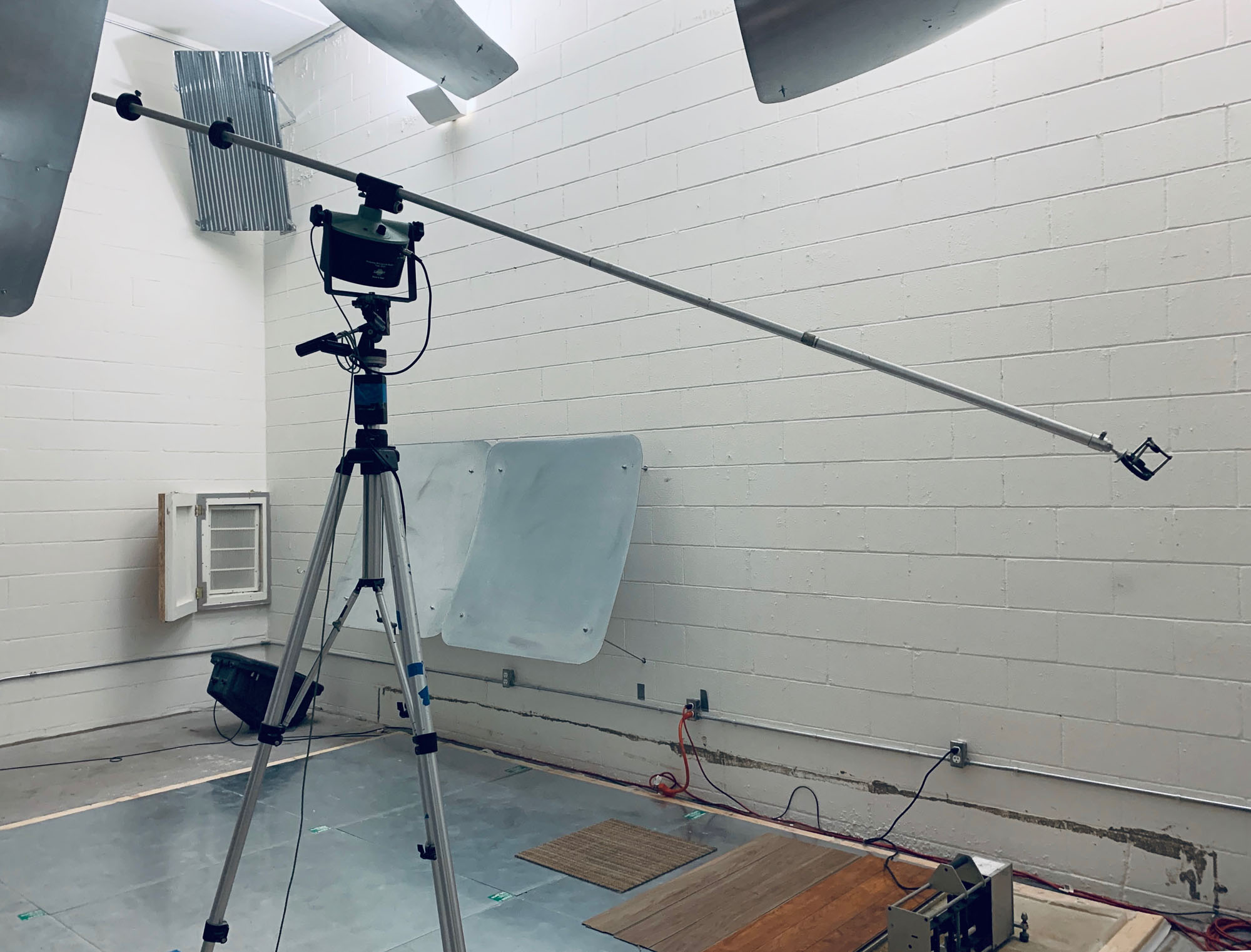
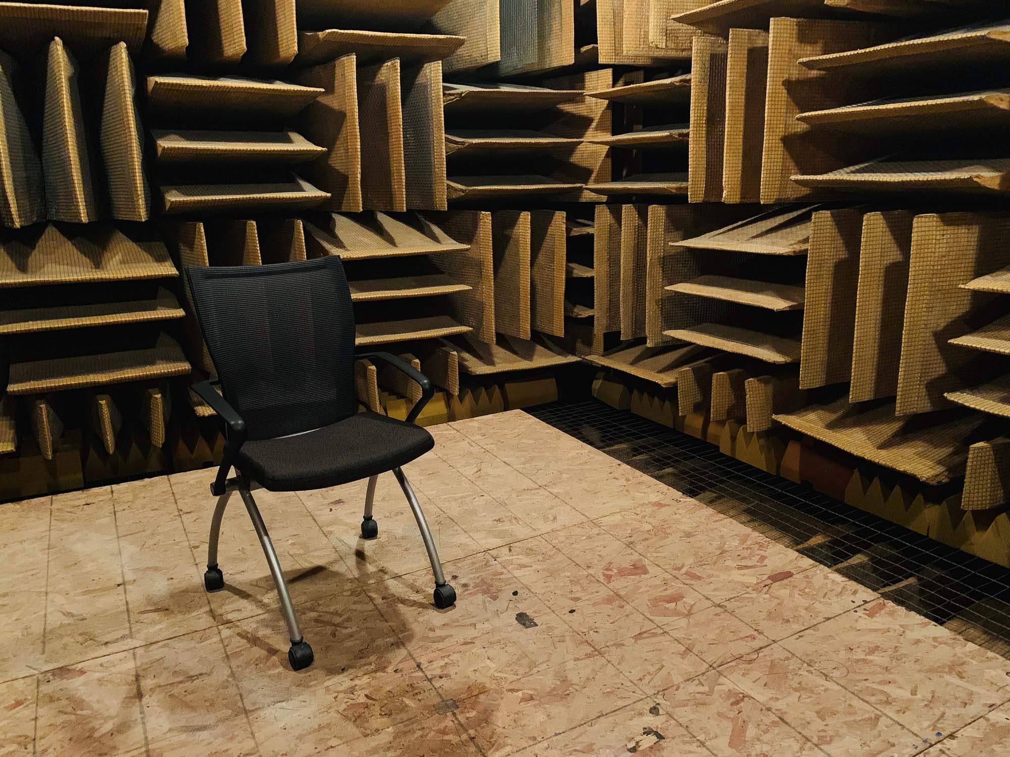
As I only had a few hours, I didn’t take my camera along, so all the photos here are shot on iPhone XS.
The Rain Room - Sharjah Art Foundation
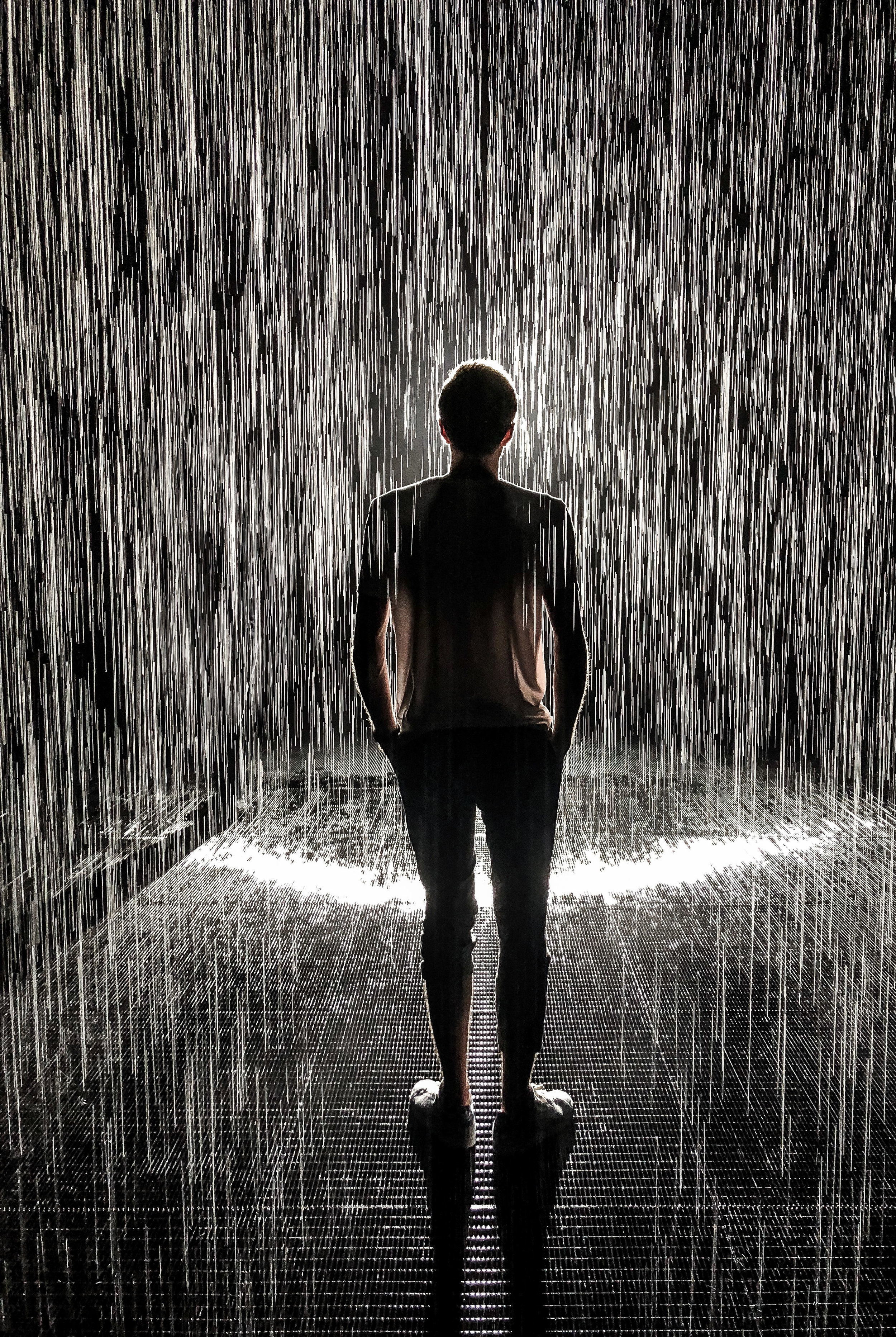
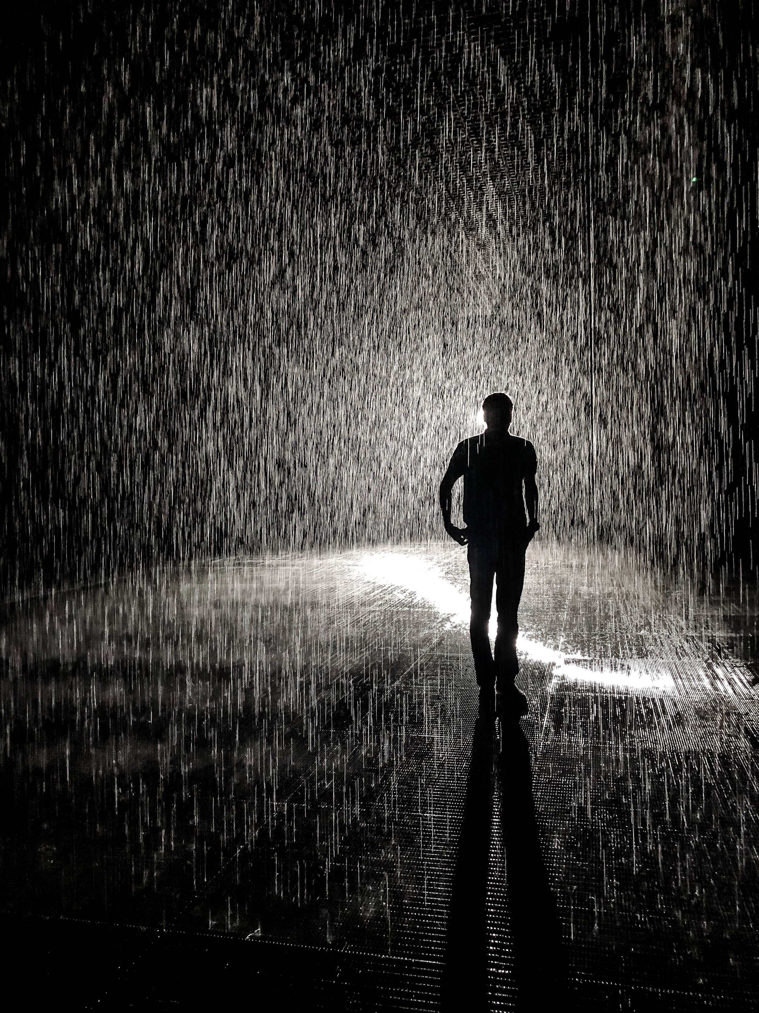
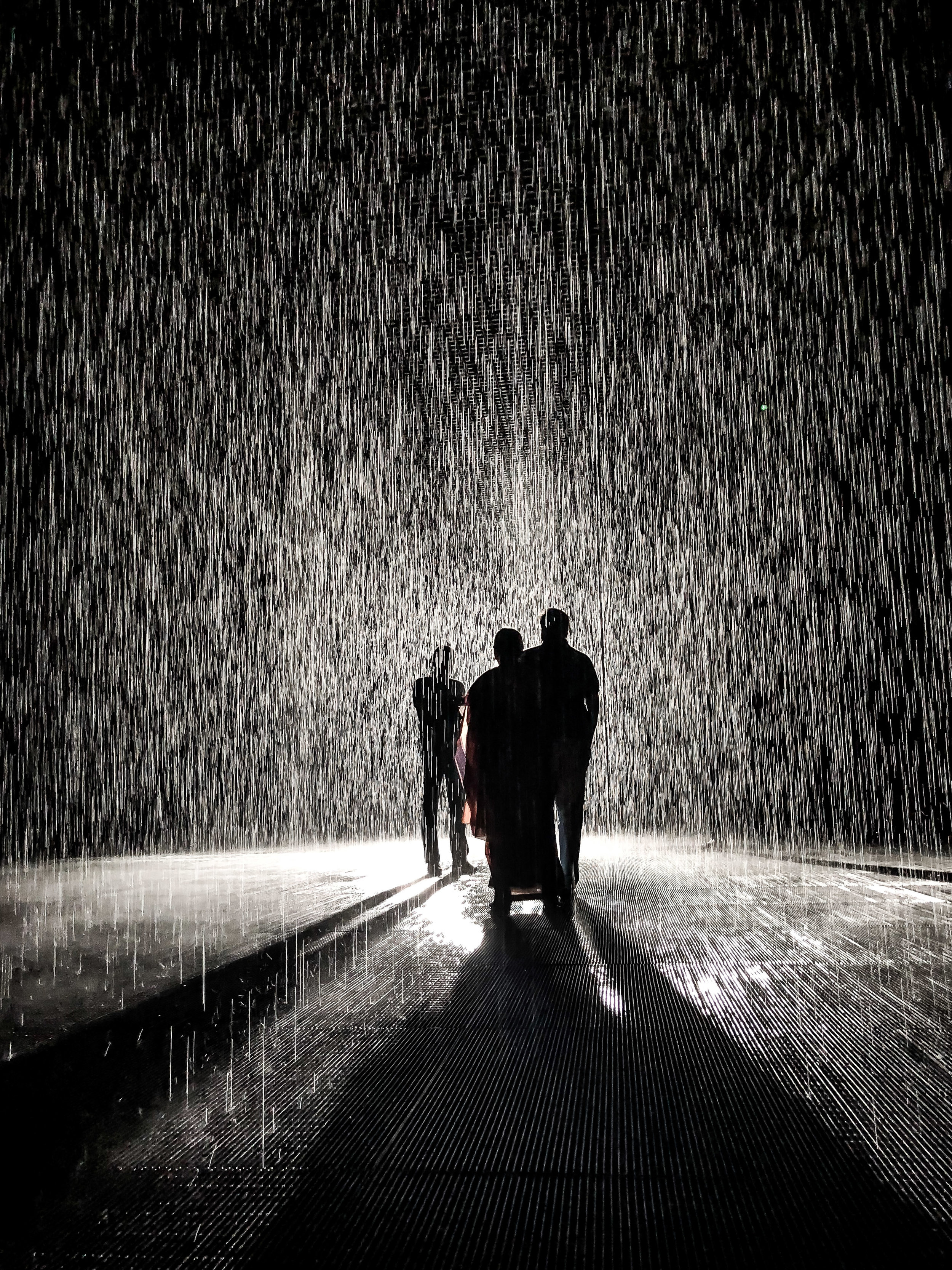
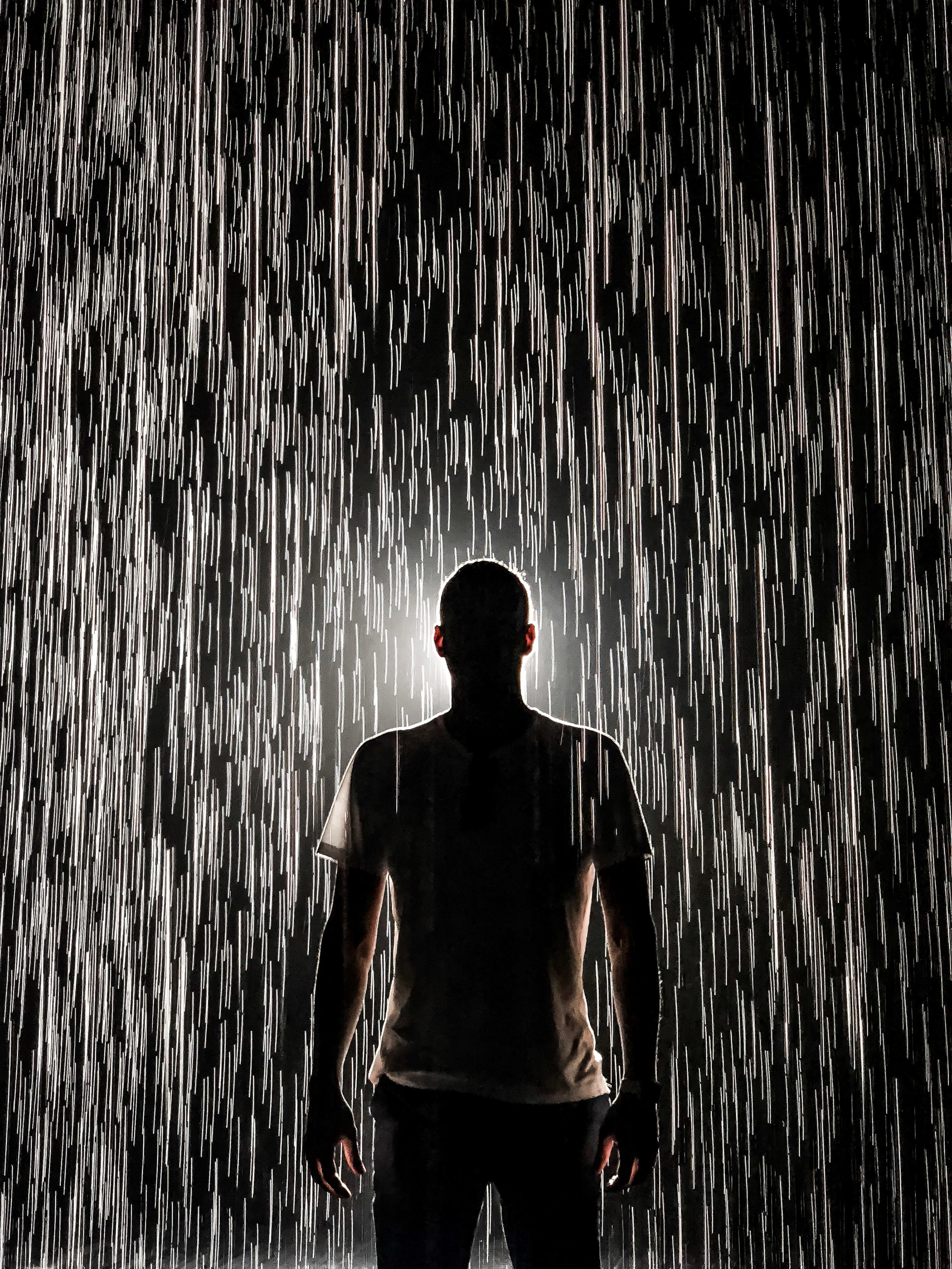
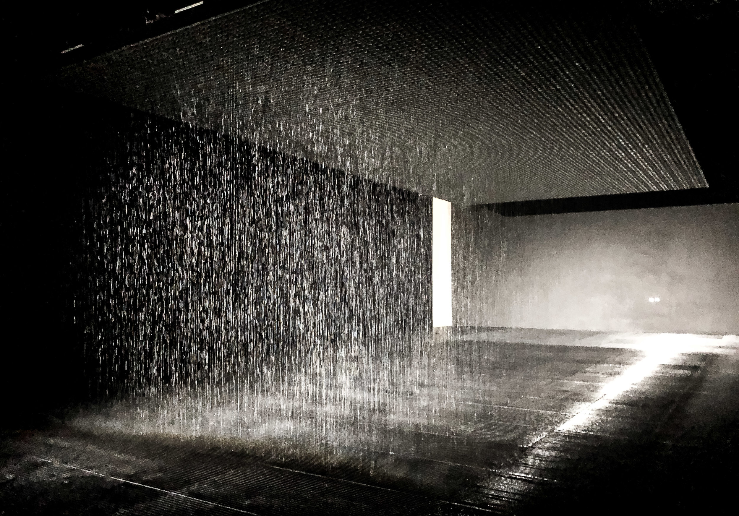
The Rain Room opened in May 2018 and is part of the Sharjah Art Foundation Collection and the first of a series of artist-designed permanent spaces. It's meant to illustrate humanity's interaction with nature through inviting you to walk through a downpour of continuous rain without getting wet.
The Rain Room opened in May 2018 and is part of the Sharjah Art Foundation Collection and the first of a series of artist-designed permanent spaces. It's meant to illustrate humanity's interaction with nature by inviting you to walk through a downpour of continuous rain without getting wet. Learn more here
Austin - HITEC 2015
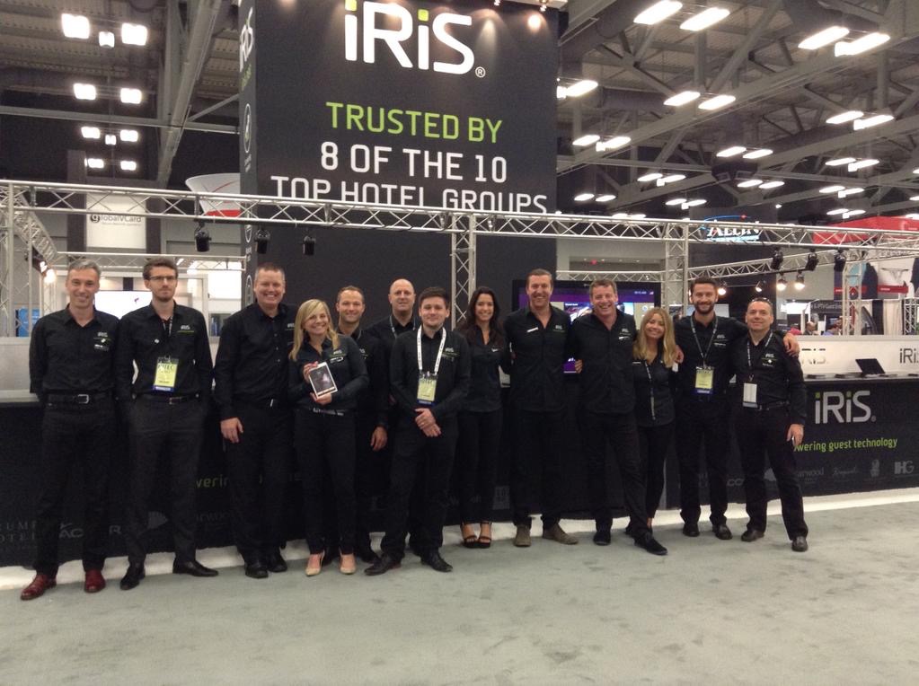
Straight from WWDC, I flew on to Austin for HITEC, the world’s biggest hospitality technology show, where iRiS has been exhibiting for the past few years. This was my second, but also last show for the company, since after 3,5 years I’m moving on to new horizons in August.
Straight from WWDC, I flew on to Austin for HITEC, the world’s biggest hospitality technology show, where iRiS has been exhibiting for the past few years. This was my second, but also last show for the company, since after 3,5 years I’m moving on to new horizons in August - more on that soon.
But before that, we still had a lot of new product to show and for that reason, the weeks before the show were very intense as always, although this year a lot of the burden was with the great teams I work with.
We had a team of 15 people I think, who stayed scattered across 3 houses in the city - much nicer than hotels. Sunday and Monday were largely spent preparing our stand and making final fixes and tweaks to the applications to get ready for the show on Tuesday.
As always, what we wanted to showcase was on the cutting edge of hospitality technology, and it took until the last minute to get everything perfectly polished and working - a big compliment goes out to my dedicated team for their effort. The highlights of our demos included Mobile Check In, Mobile Door Key, a new Windows based Lobby solution, a redesigned Brand Application and a new responsive Web Guest Service product, all with a number of integrations to third party systems such as the PMS, POS and Room Controls.
In the end, all worked pretty much flawlessly and made for a very impressed hospitality crowd, judging from the feedback I was able to gather. It also felt like we hit some of the general trends at the show - using your phone to check in and as the door key to bypass the Front Desk completely was something that everyone was after. Our excellent position in the space was also evident by the numerous partnerships with large technology companies such as Microsoft, Samsung and Oracle, all of which had iRiS products integrated to their solutions to showcase.
We also managed to explore the city of Austin a bit, parts of which actually seem quite pleasant. Granted, you get the impression you are in a place with a strong and distinct culture to say the least, but that's always part of the enjoyment of seeing new cities.
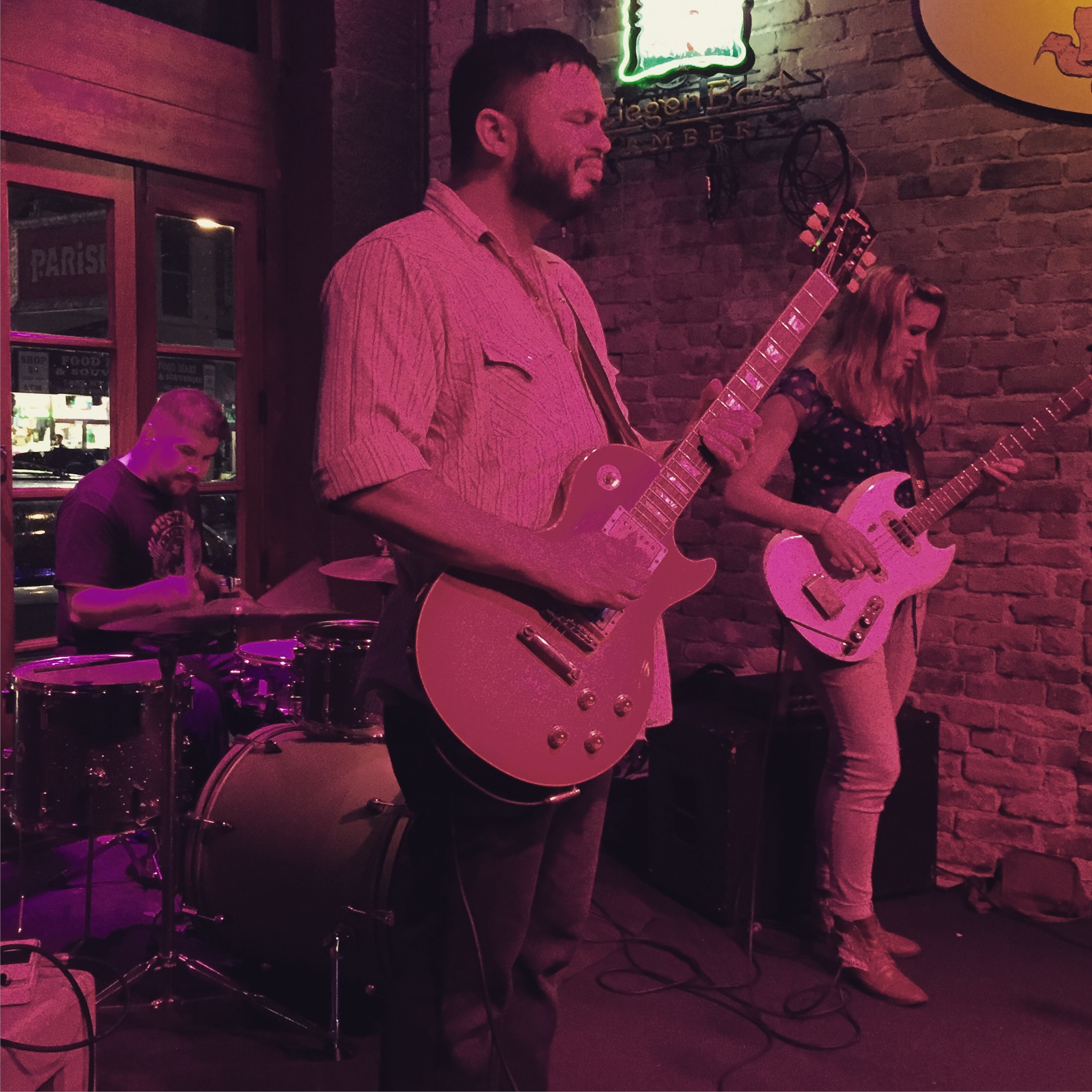
HITEC days always end with numerous dinners and parties in the evenings. While we attended the big ones such as the Samsung and Newmarket events, the local bar scene also provided some great alternatives. We were (or maybe I was) particularly lucky with the live music at two of the places we went to - that made the evenings were the rest of the people enjoyed a drink or two or three very enjoyable for me as well, not to mention that it was the last time I got to see some of my colleagues (at least they might not be "colleagues" any more next time) and of course also a few people from other companies, it's a small industry after all.
Everything was over on Friday and I left Austin at 10am in the morning, to arrive back in Dubai on Saturday evening at 8pm - a long journey indeed, but those two weeks were definitely worth the travel time.
San Francisco - WWDC 2015
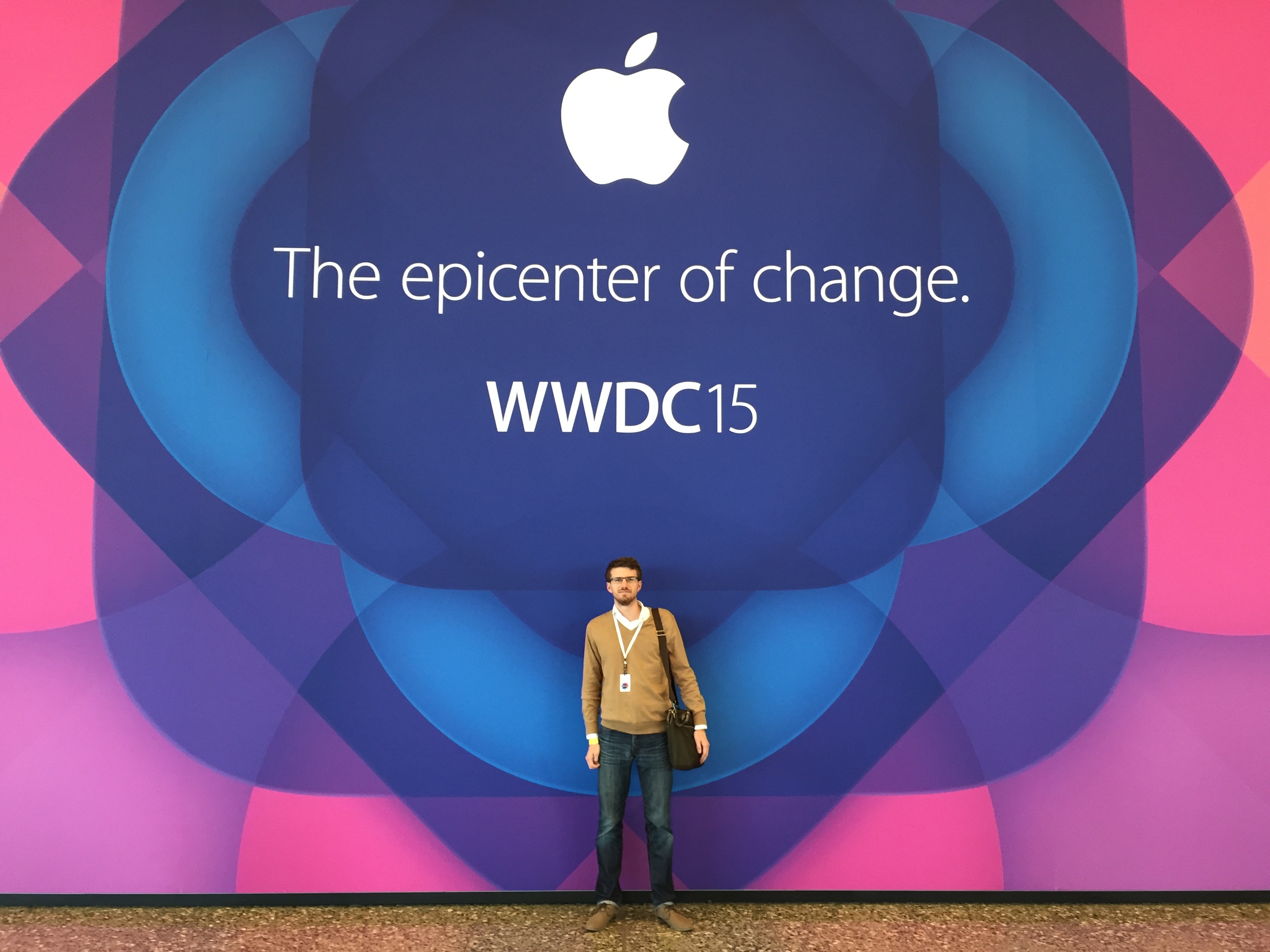
This year, I had the chance to attend WWDC, Apple’s Worldwide Developer Conference in San Francisco. While the conference is mostly known for its opening day keynote, it’s actually a full week of sessions and events.
This year, I had the chance to attend WWDC, Apple’s Worldwide Developer Conference in San Francisco. While the conference is mostly known for its opening day keynote, it’s actually a full week of sessions and events.
I’ve never thought about attending previously, but this year I got an E-Mail from Apple announcing that registration was open. Knowing that the chances of actually getting a ticket are quite low - they used to sell out in minutes, but since 2014 Apple holds a lottery to assign the around 4000 tickets - combined with the fact that it just takes two clicks to buy a ticket on Apple’s online store, I went ahead and registered. Surprisingly, I found myself waking up to a confirmation E-Mail two weeks later, which meant I had to sort out flights and a hotel. Luckily, I had to be in Austin the week after for HITEC, hence a US trip was already on the cards.
I flew in on Emirates from Dubai on Saturday before the conference on the longest flight I took so far - almost 15h. The flight interestingly takes the route over the north pole, another first for me. I arrived on Saturday afternoon and went for a quick walk through the city to get some dinner, before heading back to the hotel early - 11h jet lag was catching up with me.
Having fallen asleep at 6pm and woken up at 2am, I went out to collect my badge early on Sunday morning after a breakfast at the Ferry terminal and got a nice Apple jacket as well. I spent the rest of the day wandering through San Francisco and shopping a bit, before heading to bed early. On Monday, I got up at 5.30 am to stand in line for the keynote - I really wanted to see it live and I knew that not everyone can fit into the room. Judging from what other people said, it probably would have been enough to get there at 8 am or even later as well. Seeing an Apple keynote live was a great thing to have experienced. While nothing groundbreaking was announced, the first 115min were spot on and well executed, with OS X, iOS 9 and watchOS 2 all showing a lot of potential. Personally, I'm very excited about the watchOS, I think the wrist truly has a lot of potential for technology, far more than glasses for instance.
Things got a little out of shape with the Apple Music announcement. That holds true for the presentation itself for sure and remains to be seen for the product. Jimmy Iovine was just not able to bring the point across, followed by Drake, who wasn’t really able to either (but was sporting a cool Vintage Apple jacket). Eddy Cue was his usual self, but spent way too long demonstrating an application that looked overly complex and with no clear focus. I am skeptical if Apple is on the right track here, but agree it was time for them to change something.
The second session of the day was the Platform State of the Union, where Apple’s product people give a deeper dive into some of the announcements of the morning and how they affect developers. Definitely some cool features coming that will no doubt make their way into Apps we are using daily. Lastly, the annual Apple Design awards showcased some of the best apps for iOS and Mac that were released in the past year, among them my favourite calendar App, Fantastical, and a very cool demo of Accessibility within Apps, where two blind Apple Accessibility QA engineers were using the Workflow App. That was truly impressive.
In the evening, I attended two of the many events and parties surrounding WWDC each year. I was a bit late registering for the parties and events, so the RSVP list for many of them was closed. I did manage to get into the Pinterest party - which wasn’t particularly great - but also got an invite from Jim Dalrymple of The Loop to attend his AltBeardBash at the W hotel. Great location and a nice event with Karaoke from some of the more (or less) talented Apple followers in the industry. I also managed to chat to John Gruber of Daring Fireball briefly and secured a spot for his The Talk Show event for the Tuesday - which was absolutely worth it, more on that below.
Tuesday was a day with a few interesting sessions around UIWebView, WebKit, CloudKit and Enterprise deployments - much of them is at just about the right level for me - not being a developer - to still get a lot of value out of them, and addressed a number of points that are relevant for what I am doing in my current job. I also couldn't resist snapping a photo with Craig Federighi - Apple's SVP of Software Engineering, who is gaining fame in the geek world with his appearances at Apple's product introduction keynotes.
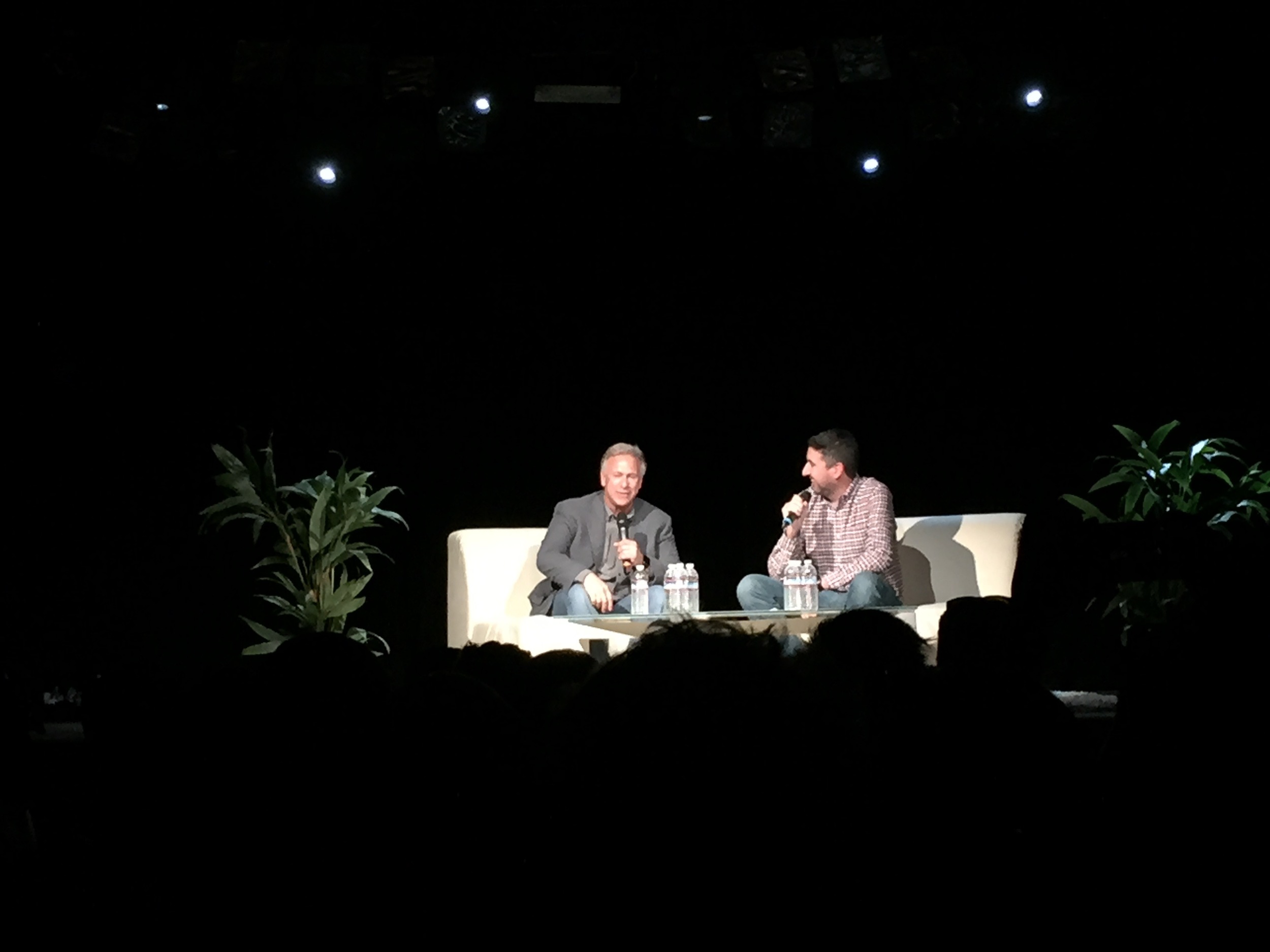
After the sessions, I headed over to John Gruber’s Talk Show event, who amazingly had Phil Schiller, Apple’s SVP of Marketing and known from many of the presentations, as his interviewee. Funnily enough I had seem him a few minutes earlier at Moscone and he was talking to someone about “walking over” - I had a hunch he might be part of the Talk Show. While the interview wasn’t groundbreaking, it was great to see them discuss some of the recent controversial topics in a somewhat private and casual setting and really shows how Apple's approach to PR has changed in the last years.
My highlight on Wednesday was a presentation by Debbie Sterling called “Think Audacious” about her journey as an Entrepreneur and the goal to bring more women into Engineering and Technology, as well as sessions on Safari and Webkit, since we work a lot on web apps at iRiS, and many of the our ongoing issues are being addressed in the upcoming releases. I also briefly attended Pebble’s / Atlassian’s WWDC party in the evening.
On Thursday, I had to take a care of a few work related things, so could not attend as many sessions as I wanted. I did see the lunch session with Disney's animation legend Floyd Norman, who gave a nice talk around how Disney's techniques evolved over time. In the evening, Apple had its yearly Bash at the Yerba Buena Gardens, with free food and drink as well as a performance by Walk The Moon, which was pretty neat. Surprisingly, developers are actually capable of enthusiastically enjoying a live performance!
Friday was the last day of the conference, with a few interesting sessions, among them new features in UI Dynamics, Notifications and the new system fonts in Apple's Operation Systems. I found topics like UI Dyanmics or the system font were particularly interesting, as many of the concepts involve bring together other disciplines - it's very typical for what Apple calls the intersection of technology and liberal arts. While my knowledge on typography is limited at best, it's easy to take good looking fonts for granted, when in fact there is an incredible amount of thinking, design and research behind them. The lunchtime session was a great talk on planet discovery. It's great that Apple is breaking up the presentations and labs with some broader talks on science, creativity or entrepreneurship.
After a short night's sleep, I headed to the airport to fly over to Austin for HITEC. More on that later. All in all, I'd recommend to attend WWDC at least once to anyone who is working on a product in Apple's ecosystem in some technical capacity. While there is most value for developers, even if you are not actually writing the 1's and 0's there are many sessions and labs that are useful on a higher level. I am not sure I'd fly in from Dubai just for WWDC every year, but since I had to go to the US anyway, it was a no brainer.


