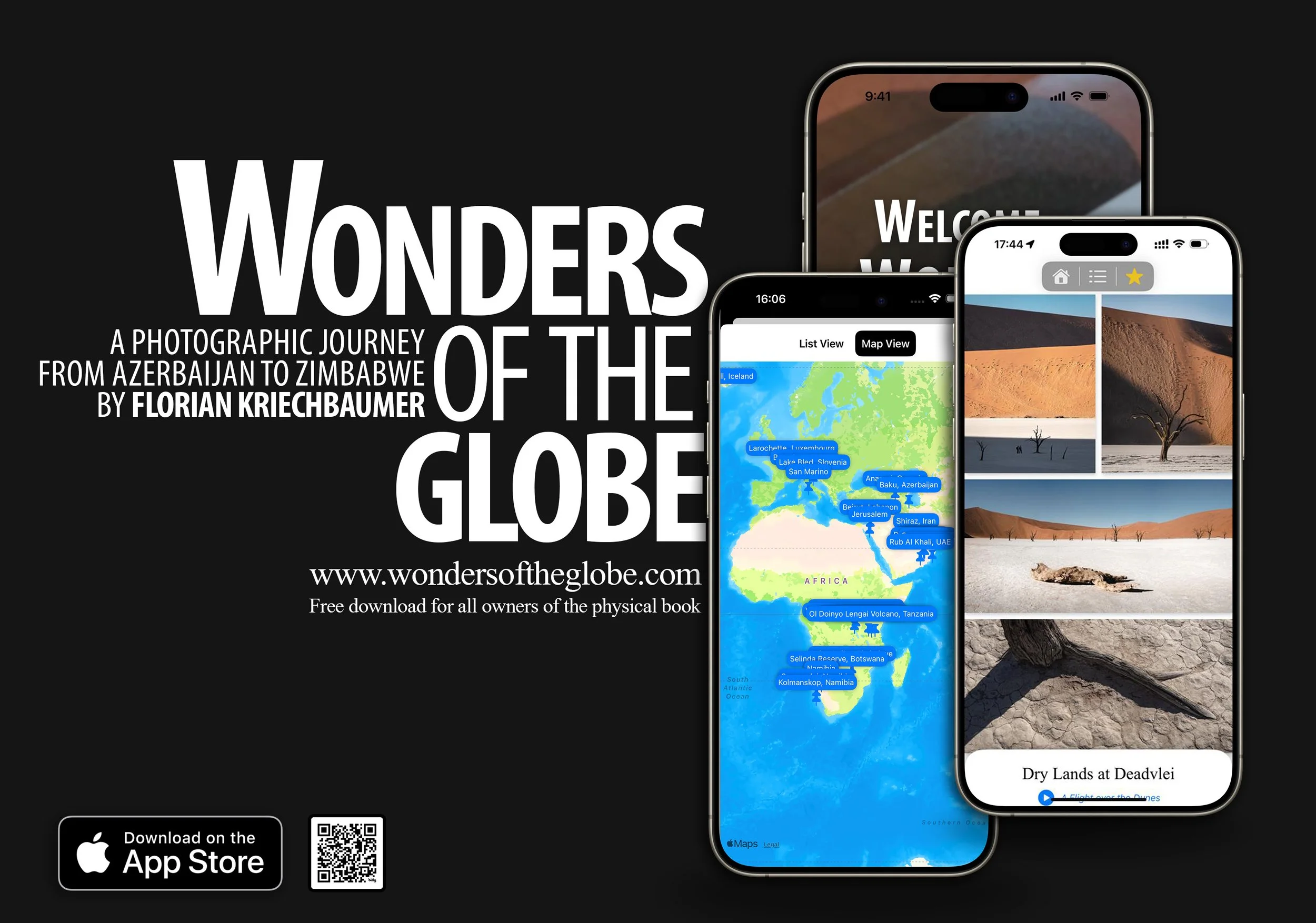
The “Wonders of the Globe” App
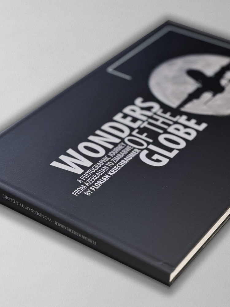
As some of you may have seen, I recently self-published a photo book called “Wonders of the Globe”, documenting some of the amazing places I had the privilege to see and photograph, and - as is often the case with my projects - just to see “what it’s like” to design, compile, write, print, and sell your own photo book.
The Book
It was an interesting experience, with quite a bit of trial and error, a few learnings, and also a look at the economic realities. I did everything in house, including building the website and ordering capability, which nowadays is pretty straight forward thanks to places like Squarespace, and Stripe (which this page is built on).
I’ve been making and selling prints for a long time and have always enjoyed seeing photography in physical form, rather than just on screens. At the same time, there are many things that a print or book just can’t represent the same way as digital art - something I’ve been toying with as part of my NFT series.
For Wonders of the Globe, creating a digital version was on the agenda from the beginning, but what exactly it would look like only evolved out of my desire to finally get my hands dirty writing code, and the fact there are now AI tools to help you make that a little easier.
For most of my “regular” career I’ve been really involved in software development, be it apps for hospitality, or energy management systems for buildings, always managing or working closely with engineers. That gave me a lot of insight into everything from UI and UX designs, databases, App stores, embedded development, architecture for cloud platforms, etc, and I’ve picked up a fair bit of knowledge in the process.
But I always had the urge to start creating a piece of software from scratch myself (aside from making a few websites) and this was the opportunity to do just that. Having been a follower of Apple and user of their products for a long time, the only real option for me was to start with their platform, and getting to know Swift UI, the latest programming language for its products (and one of the easier ones out there, also thanks to Apple’s ecosystem).
Main Goals
My primary idea behind creating a digital version included the following:
Be able to update the content regularly, so that owners of the physical copy can also get access to new photos
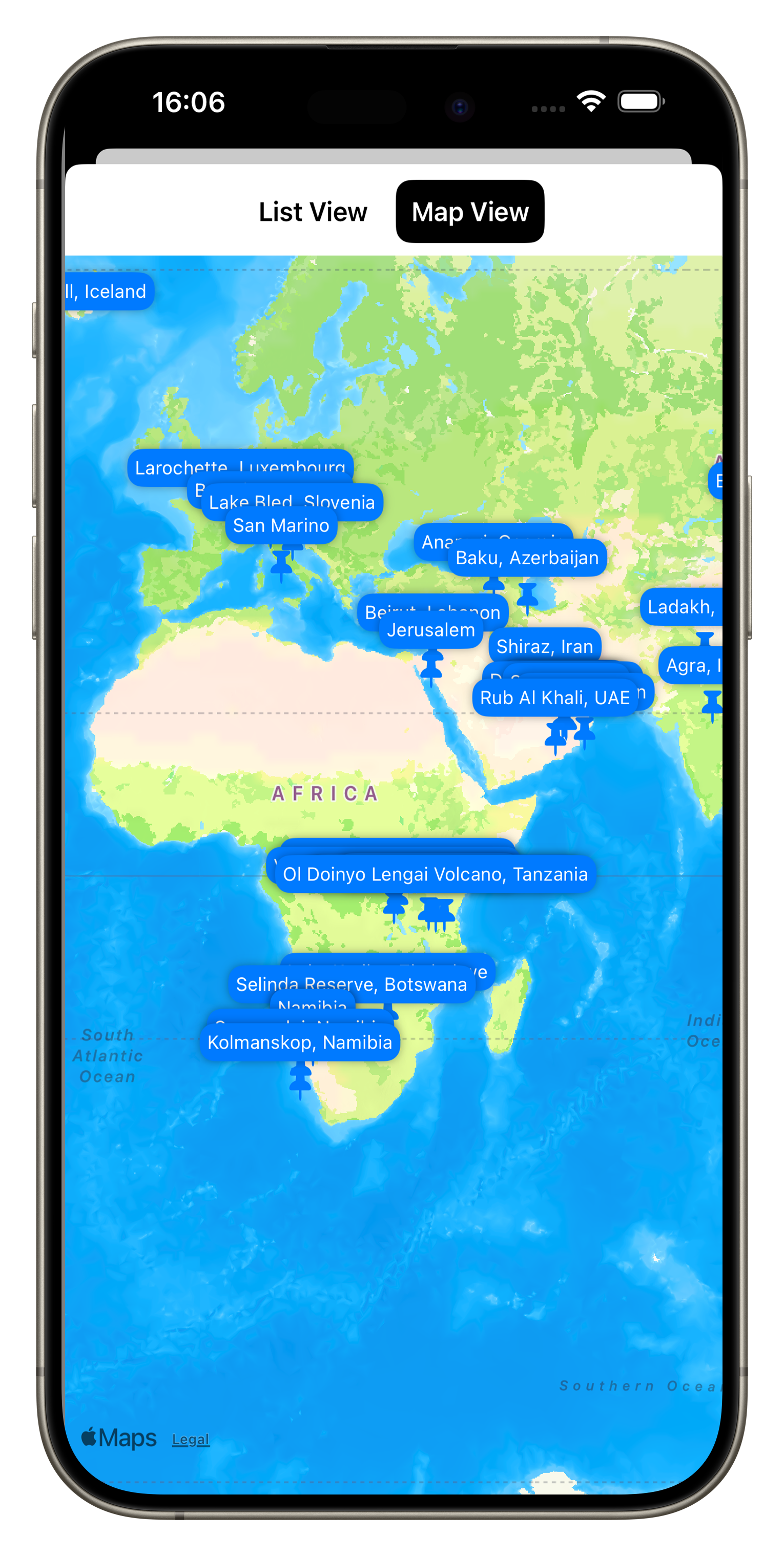
Include some interactive features like Maps for each spot, and a table of contents
Be able to link to relevant blog entries for some of the photos
Add some behind the scenes and supporting videos
Make it work on iPhone, iPad, Mac, and the Apple Vision Pro
For the App to work offline
The Journey
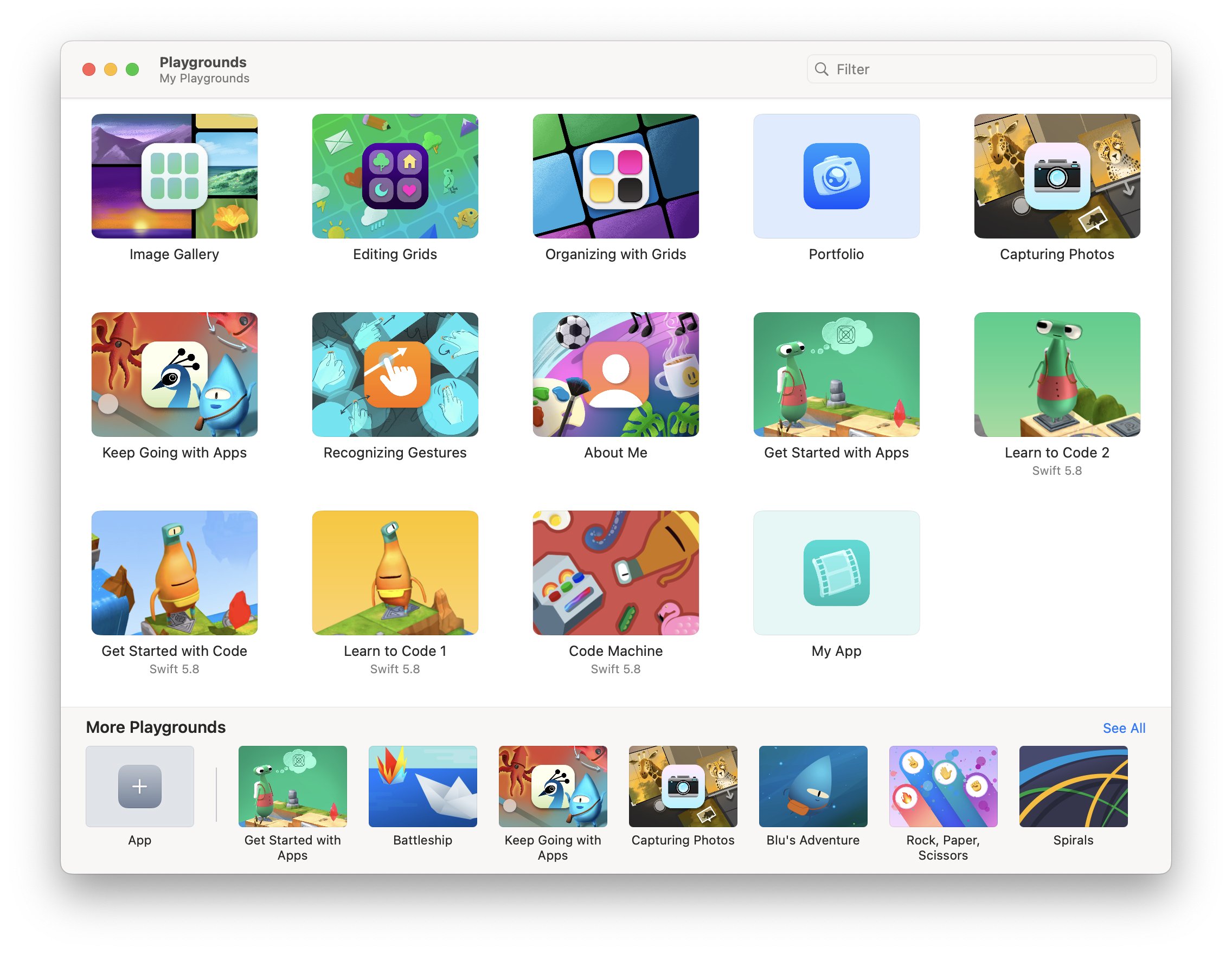
So in October 2023 I started teaching myself Swift UI using Apple’s Swift Playground App, a simple playful way to learn basic concepts on business logic and layout. It also includes a few examples on building grids and image-based layouts, which was very helpful.
From there, I soon moved over to Xcode, Apple’s integrated development environment, and started building the structure of the app. My goal was to build a completely native app, not using any third party tools.
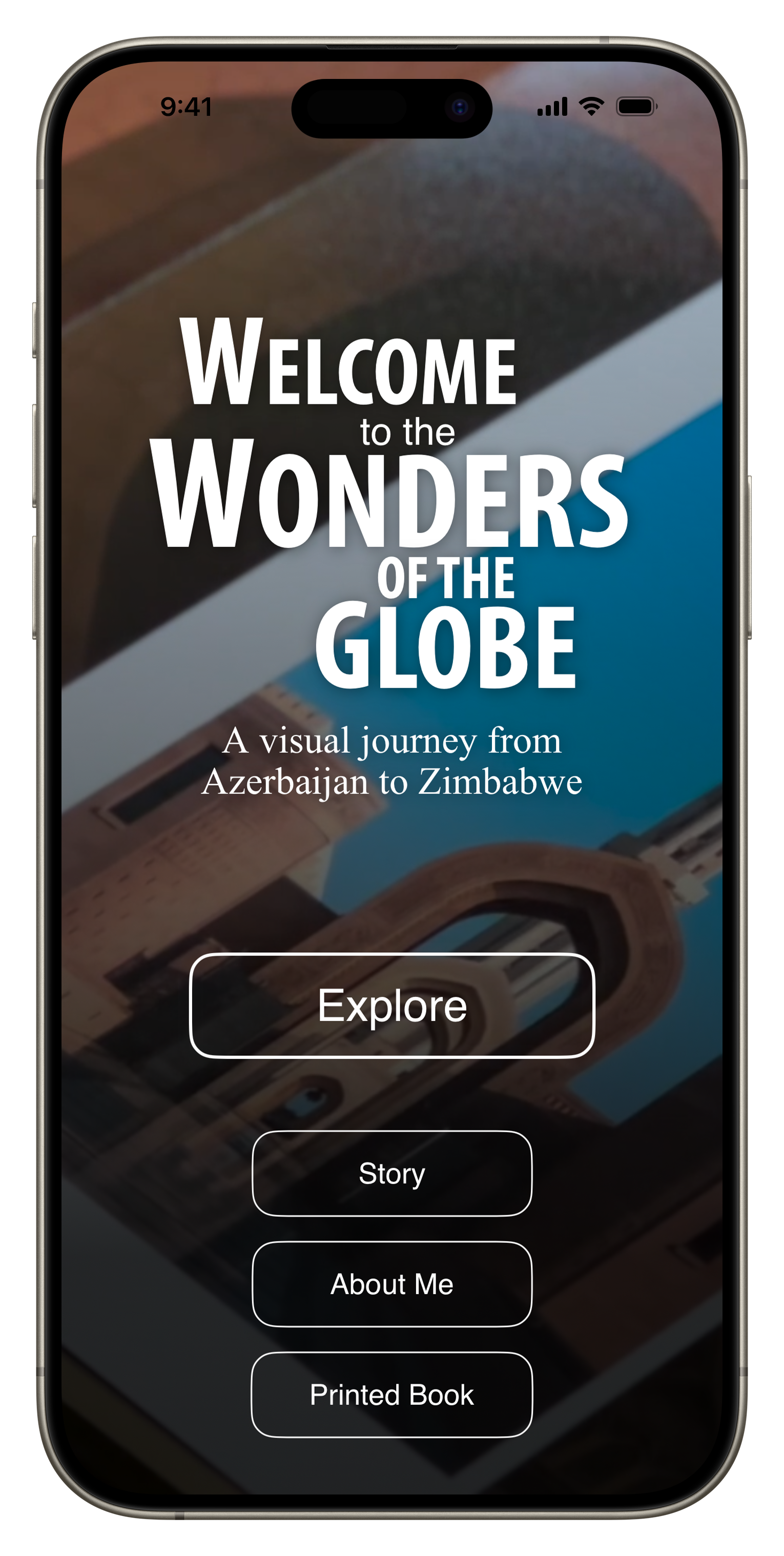
The basic structure of the app was built relatively quickly, including a homepage, some supplementary pages, and the main book section. Over time I added a map view, table of content function, and a favorite function for the user to mark and recall interesting pages quickly.
My past experience came in handy in designing a scalable, flexible, and maintainable system that would allow me to manage the book content in one place (I chose a simple JSON file) and minimizing the number of layouts for individual “pages” of the book. I built generic layout views depending on the number of images on each page and their aspect ratio (I ended up with 11 for 54 pages, which probably could have been reduced further with some optimization), and rendered all other common elements such as the buttons and text overlay separately.
A few things that stood out to me: It was quite simple to add basic animations and effects such as blurs and backgrounds to create a bit more visual interest. A lot of built in tools like navigation links, sheets, and tab views simplify creating the main structural elements and views significantly.
On the other hand, there were several things that proved to be more of a headache than I anticipated, for example managing performance of image loading and thumbnails, and particularly gestures for zooming, panning, swiping, and their interaction / conflicts - this took way more time than I had expected, just to replicate what the built in Photos app can do. Making simple image layouts that scale and resize nicely was also more challenging than on many common web platforms. There are still a few aspects in the app around these features that are not ideal.
The biggest initial hurdle for me was understanding how to build the data model out of the JSON file, i.e. the piece of code that holds all the book information and images, and can be accessed and updated by different parts of the app. Once that was figured out though, it became quite easy to add new pieces and create a flexible infrastructure.
AI Help
ChatGTP also proved to be incredibly helpful in fixing issues or suggesting minor improvements to my code. As of December 2023, version 3.5 often produced more helpful output than ChatGTP 4 for specific code level requests, while generic questions produced better answers with version 4, partly owing to its more recent training data set.
While it was 100% necessary to have an understanding of the architecture, code, best practices, and an overall vision of the app, it definitely saved me dozens of hours in debugging and researching certain features of the programming language.
A draft version of the App was finished in early January, when I asked a few friends to beta test them using Apple’s TestFlight App (a simple way to get feedback and allow others to access your app without making it public). I also used the Xcode simulator to run it on older devices and different screen sizes, including iPad and Mac, to see how the layouts would work.
I fixed a few minor issues and submitted the app to the AppStore shortly after, just needing to add promotional text, screenshots, privacy policy and manage some administrative aspects, plus setting the price. As my main goal was to create the app as a companion for the physical book, I chose to make it free for owners of the book, and have everyone else who wants it pay $2.99 - whether anyone will do so remains to be seen, but art should have value.
After an initial rejection based on rule 4.2 (the app should serve a purpose that is more advanced than a simple website), I explained to App review some of the features of the app that cannot be replicated on a website easily (favorite function, offline caching, etc), and they accepted the next revision.
As a result, the app is now live on the App Store - tap on the image above to see and download it. If you’re an owner of Wonders of the Globe, you should receive a code that enables a free download, if not, please contact me.
While this is a first version of the app and it is admittedly quite simple, I have a few more features in mind for upcoming releases:
Landscape mode support (for now the App works only in Portrait orientation)
A better layout for iPad and larger screens (I really want to test it on Apple Vision Pro as well)
A home screen widget with a random new photo from the portfolio every day
Being able to add new content without needing a new version of the app (this will require me to build a server side interface, let’s see if that’s something I want to tackle!)
For now, it’s been a nice project the hopefully brings some enjoyment to a few of you.
