The “Wonders of the Globe” App
Creating a digital version of my photo book “Wonders of the Globe” as a native iOS app.
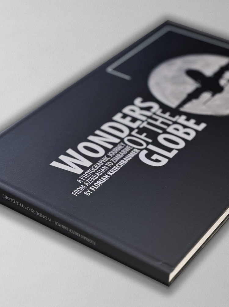
As some of you may have seen, I recently self-published a photo book called “Wonders of the Globe”, documenting some of the amazing places I had the privilege to see and photograph, and - as is often the case with my projects - just to see “what it’s like” to design, compile, write, print, and sell your own photo book.
The Book
It was an interesting experience, with quite a bit of trial and error, a few learnings, and also a look at the economic realities. I did everything in house, including building the website and ordering capability, which nowadays is pretty straight forward thanks to places like Squarespace, and Stripe (which this page is built on).
I’ve been making and selling prints for a long time and have always enjoyed seeing photography in physical form, rather than just on screens. At the same time, there are many things that a print or book just can’t represent the same way as digital art - something I’ve been toying with as part of my NFT series.
For Wonders of the Globe, creating a digital version was on the agenda from the beginning, but what exactly it would look like only evolved out of my desire to finally get my hands dirty writing code, and the fact there are now AI tools to help you make that a little easier.
For most of my “regular” career I’ve been really involved in software development, be it apps for hospitality, or energy management systems for buildings, always managing or working closely with engineers. That gave me a lot of insight into everything from UI and UX designs, databases, App stores, embedded development, architecture for cloud platforms, etc, and I’ve picked up a fair bit of knowledge in the process.
But I always had the urge to start creating a piece of software from scratch myself (aside from making a few websites) and this was the opportunity to do just that. Having been a follower of Apple and user of their products for a long time, the only real option for me was to start with their platform, and getting to know Swift UI, the latest programming language for its products (and one of the easier ones out there, also thanks to Apple’s ecosystem).
Main Goals
My primary idea behind creating a digital version included the following:
Be able to update the content regularly, so that owners of the physical copy can also get access to new photos
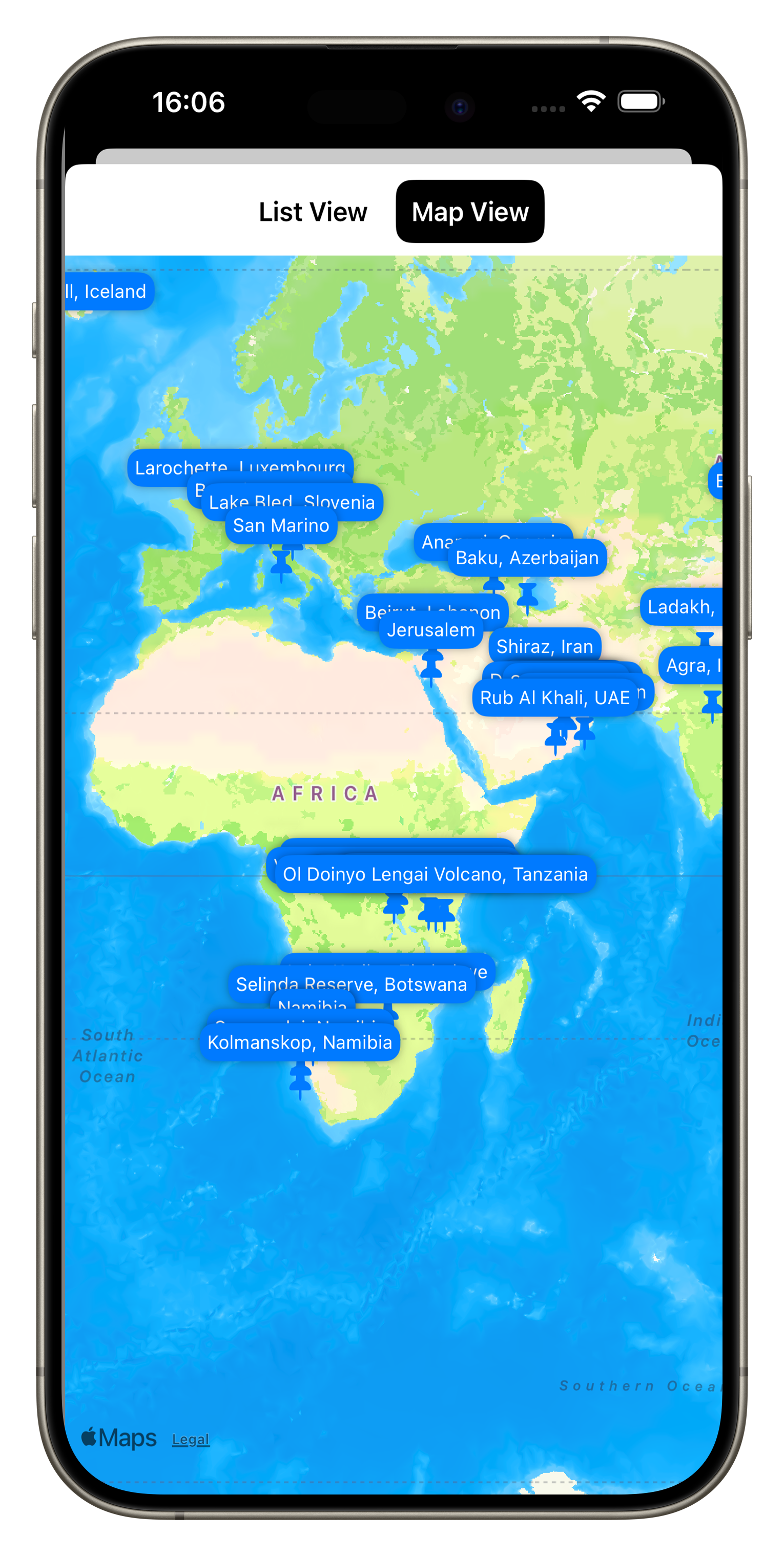
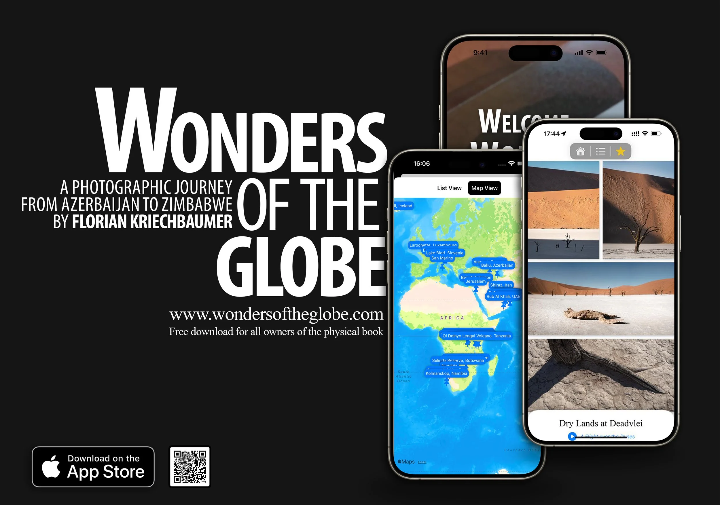
Include some interactive features like Maps for each spot, and a table of contents
Be able to link to relevant blog entries for some of the photos
Add some behind the scenes and supporting videos
Make it work on iPhone, iPad, Mac, and the Apple Vision Pro
For the App to work offline
The Journey
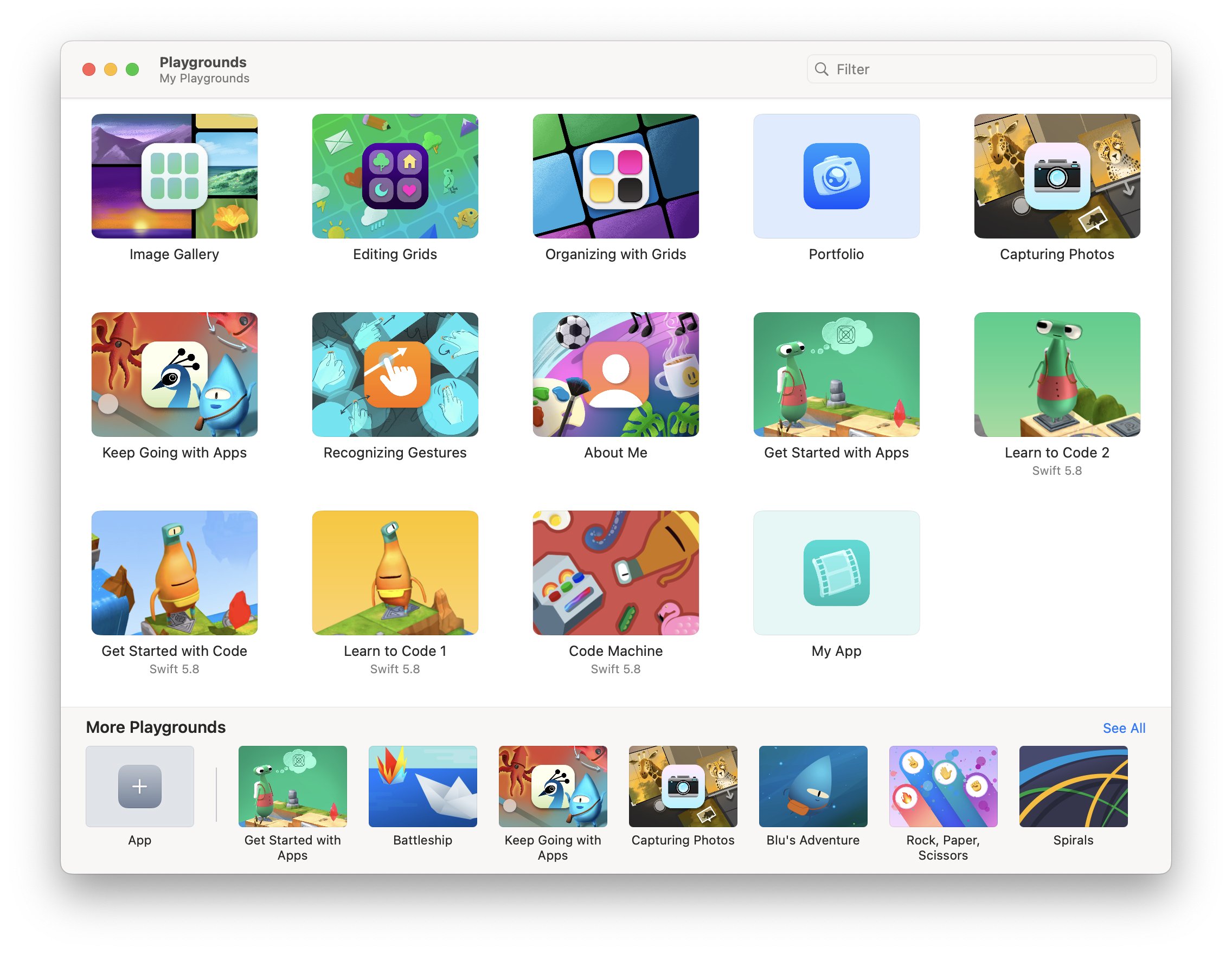
So in October 2023 I started teaching myself Swift UI using Apple’s Swift Playground App, a simple playful way to learn basic concepts on business logic and layout. It also includes a few examples on building grids and image-based layouts, which was very helpful.
From there, I soon moved over to Xcode, Apple’s integrated development environment, and started building the structure of the app. My goal was to build a completely native app, not using any third party tools.
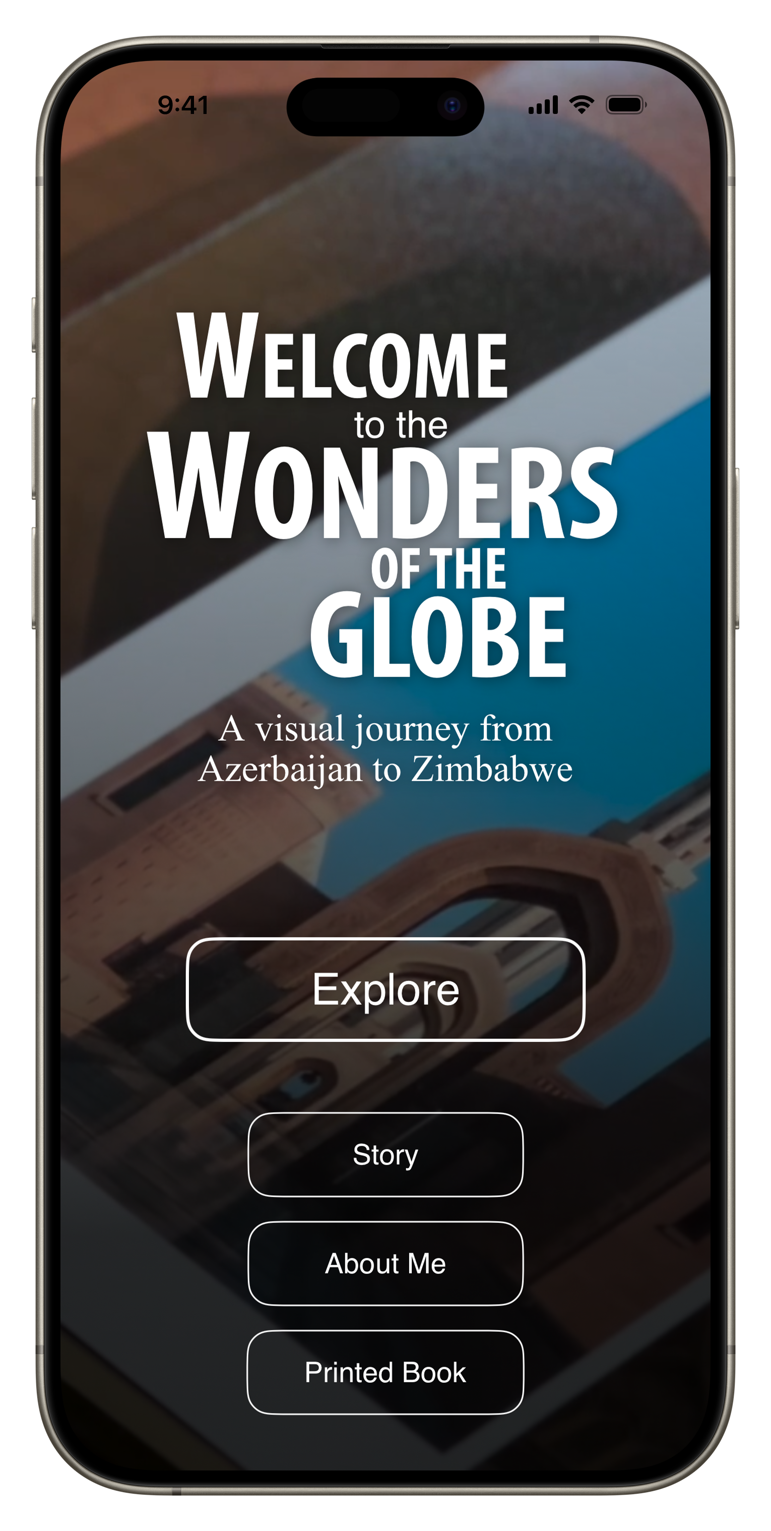
The basic structure of the app was built relatively quickly, including a homepage, some supplementary pages, and the main book section. Over time I added a map view, table of content function, and a favorite function for the user to mark and recall interesting pages quickly.
My past experience came in handy in designing a scalable, flexible, and maintainable system that would allow me to manage the book content in one place (I chose a simple JSON file) and minimizing the number of layouts for individual “pages” of the book. I built generic layout views depending on the number of images on each page and their aspect ratio (I ended up with 11 for 54 pages, which probably could have been reduced further with some optimization), and rendered all other common elements such as the buttons and text overlay separately.
A few things that stood out to me: It was quite simple to add basic animations and effects such as blurs and backgrounds to create a bit more visual interest. A lot of built in tools like navigation links, sheets, and tab views simplify creating the main structural elements and views significantly.
On the other hand, there were several things that proved to be more of a headache than I anticipated, for example managing performance of image loading and thumbnails, and particularly gestures for zooming, panning, swiping, and their interaction / conflicts - this took way more time than I had expected, just to replicate what the built in Photos app can do. Making simple image layouts that scale and resize nicely was also more challenging than on many common web platforms. There are still a few aspects in the app around these features that are not ideal.
The biggest initial hurdle for me was understanding how to build the data model out of the JSON file, i.e. the piece of code that holds all the book information and images, and can be accessed and updated by different parts of the app. Once that was figured out though, it became quite easy to add new pieces and create a flexible infrastructure.
AI Help
ChatGTP also proved to be incredibly helpful in fixing issues or suggesting minor improvements to my code. As of December 2023, version 3.5 often produced more helpful output than ChatGTP 4 for specific code level requests, while generic questions produced better answers with version 4, partly owing to its more recent training data set.
While it was 100% necessary to have an understanding of the architecture, code, best practices, and an overall vision of the app, it definitely saved me dozens of hours in debugging and researching certain features of the programming language.
A draft version of the App was finished in early January, when I asked a few friends to beta test them using Apple’s TestFlight App (a simple way to get feedback and allow others to access your app without making it public). I also used the Xcode simulator to run it on older devices and different screen sizes, including iPad and Mac, to see how the layouts would work.
I fixed a few minor issues and submitted the app to the AppStore shortly after, just needing to add promotional text, screenshots, privacy policy and manage some administrative aspects, plus setting the price. As my main goal was to create the app as a companion for the physical book, I chose to make it free for owners of the book, and have everyone else who wants it pay $2.99 - whether anyone will do so remains to be seen, but art should have value.
After an initial rejection based on rule 4.2 (the app should serve a purpose that is more advanced than a simple website), I explained to App review some of the features of the app that cannot be replicated on a website easily (favorite function, offline caching, etc), and they accepted the next revision.
As a result, the app is now live on the App Store - tap on the image above to see and download it. If you’re an owner of Wonders of the Globe, you should receive a code that enables a free download, if not, please contact me.
While this is a first version of the app and it is admittedly quite simple, I have a few more features in mind for upcoming releases:
Landscape mode support (for now the App works only in Portrait orientation)
A better layout for iPad and larger screens (I really want to test it on Apple Vision Pro as well)
A home screen widget with a random new photo from the portfolio every day
Being able to add new content without needing a new version of the app (this will require me to build a server side interface, let’s see if that’s something I want to tackle!)
For now, it’s been a nice project the hopefully brings some enjoyment to a few of you.
Subscribe to my newsletter to get notified and don’t miss out on more Wonders of the Globe.
Other Recent Posts:
Print Works
For several months I had the idea in my head to create a few fine art prints of my photography, possibly in a small edition or similar. With tens of thousands of photos in my collection, surely there must be the odd one that would look good in print.
For several months I had the idea in my head to create a few fine art prints of my photography, possibly in a small edition or similar. With tens of thousands of photos in my collection, surely there must be the odd one that would look good in print.
A few weeks ago I went to a photography trade show in Dubai and ran into Rick from www.digitalprintmaker.com - located in Al Quoz in Dubai. Great guy and was able to give me some good and genuine advice on the process and paper choices.
I had previously only printed a few books from Apple's Aperture store, as well as some random small standard prints and one canvas print which is now hanging in my apartment, so my experience with true fine art printing was limited.
When I went to his shop we had the chance to go through his collection of paper types. I had the plan to try different types for different images and realized that picking photos you really (!) like is much harder when it is about choosing a print, and not just putting them on Facebook.
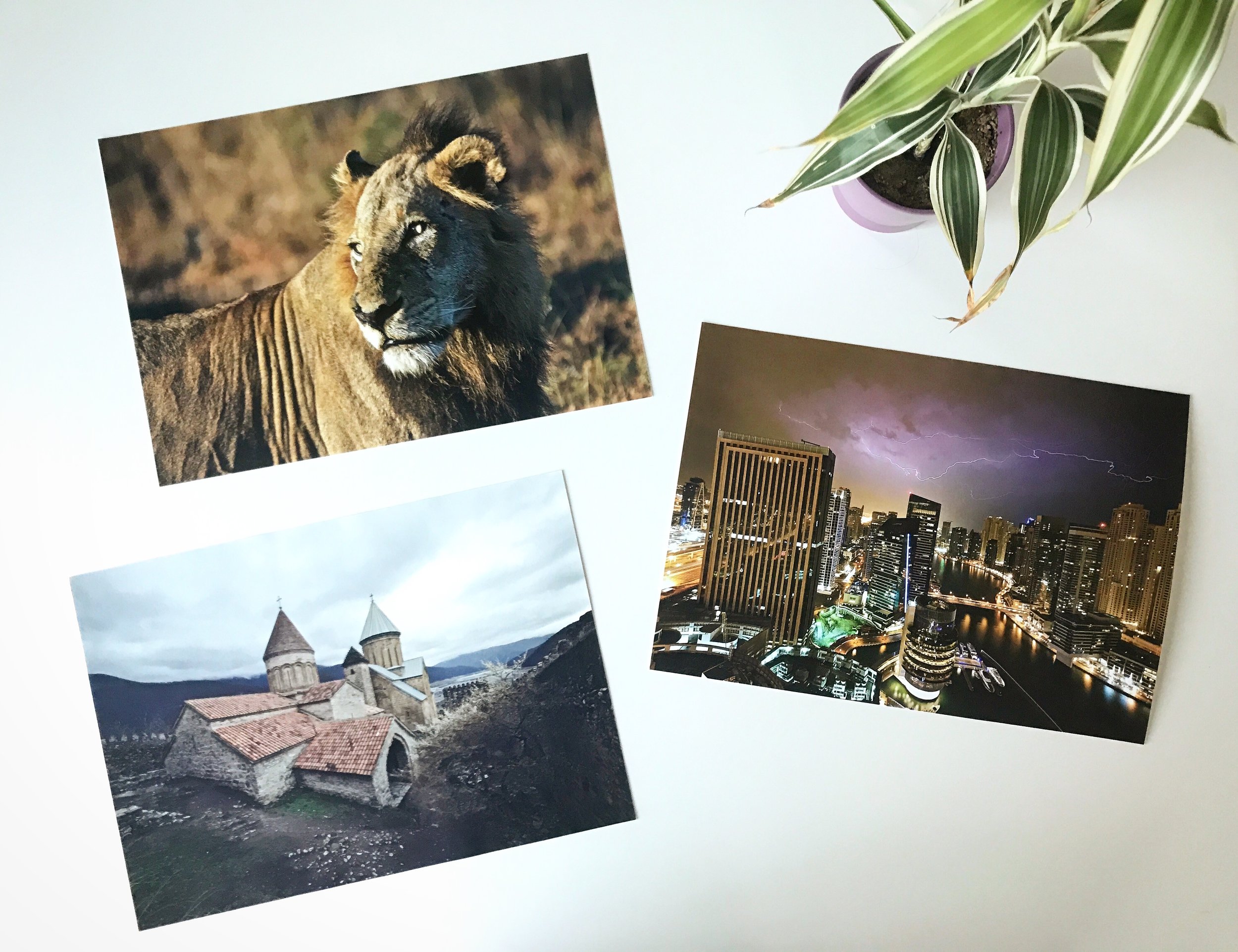
The papers he had were of excellent variety, and I settled for German quality from https://www.hahnemuehle.com which makes paper for over 500 years, and picked three different variants:
308 gsm Photo Rag® 100% cotton rag paper
325 gsm Fine Art Baryta Gloss alpha cellulose paper
305 gsm Photo Rag® Ultra Smooth 100% cotton rag paper
For the lion, city and church subjects, respectively. All prints are 35 x 25cm.
I'm very happy with the result of the test print, particularly the non-gloss variants. I'll have to take another look at gloss or satin options next time, as the current paper feels less special than the others. In the end, this is more an emotional aspect than anything scientific, aside from the texture it's difficult to tell the difference in quality.
Now it's time to look at some frames and for these shots and then possibly make a small edition print for sale - I also want to try bigger sizes.
Austin - HITEC 2015
Straight from WWDC, I flew on to Austin for HITEC, the world’s biggest hospitality technology show, where iRiS has been exhibiting for the past few years. This was my second, but also last show for the company, since after 3,5 years I’m moving on to new horizons in August.
Straight from WWDC, I flew on to Austin for HITEC, the world’s biggest hospitality technology show, where iRiS has been exhibiting for the past few years. This was my second, but also last show for the company, since after 3,5 years I’m moving on to new horizons in August - more on that soon.
But before that, we still had a lot of new product to show and for that reason, the weeks before the show were very intense as always, although this year a lot of the burden was with the great teams I work with.
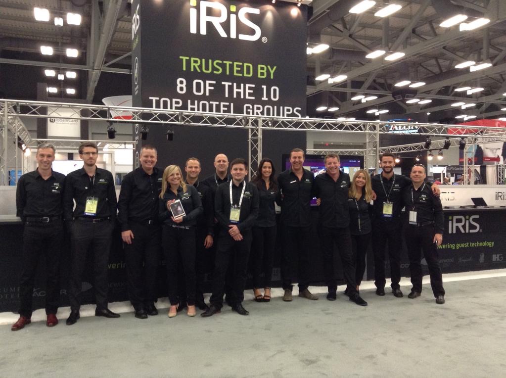
We had a team of 15 people I think, who stayed scattered across 3 houses in the city - much nicer than hotels. Sunday and Monday were largely spent preparing our stand and making final fixes and tweaks to the applications to get ready for the show on Tuesday.
As always, what we wanted to showcase was on the cutting edge of hospitality technology, and it took until the last minute to get everything perfectly polished and working - a big compliment goes out to my dedicated team for their effort. The highlights of our demos included Mobile Check In, Mobile Door Key, a new Windows based Lobby solution, a redesigned Brand Application and a new responsive Web Guest Service product, all with a number of integrations to third party systems such as the PMS, POS and Room Controls.
In the end, all worked pretty much flawlessly and made for a very impressed hospitality crowd, judging from the feedback I was able to gather. It also felt like we hit some of the general trends at the show - using your phone to check in and as the door key to bypass the Front Desk completely was something that everyone was after. Our excellent position in the space was also evident by the numerous partnerships with large technology companies such as Microsoft, Samsung and Oracle, all of which had iRiS products integrated to their solutions to showcase.
We also managed to explore the city of Austin a bit, parts of which actually seem quite pleasant. Granted, you get the impression you are in a place with a strong and distinct culture to say the least, but that's always part of the enjoyment of seeing new cities.
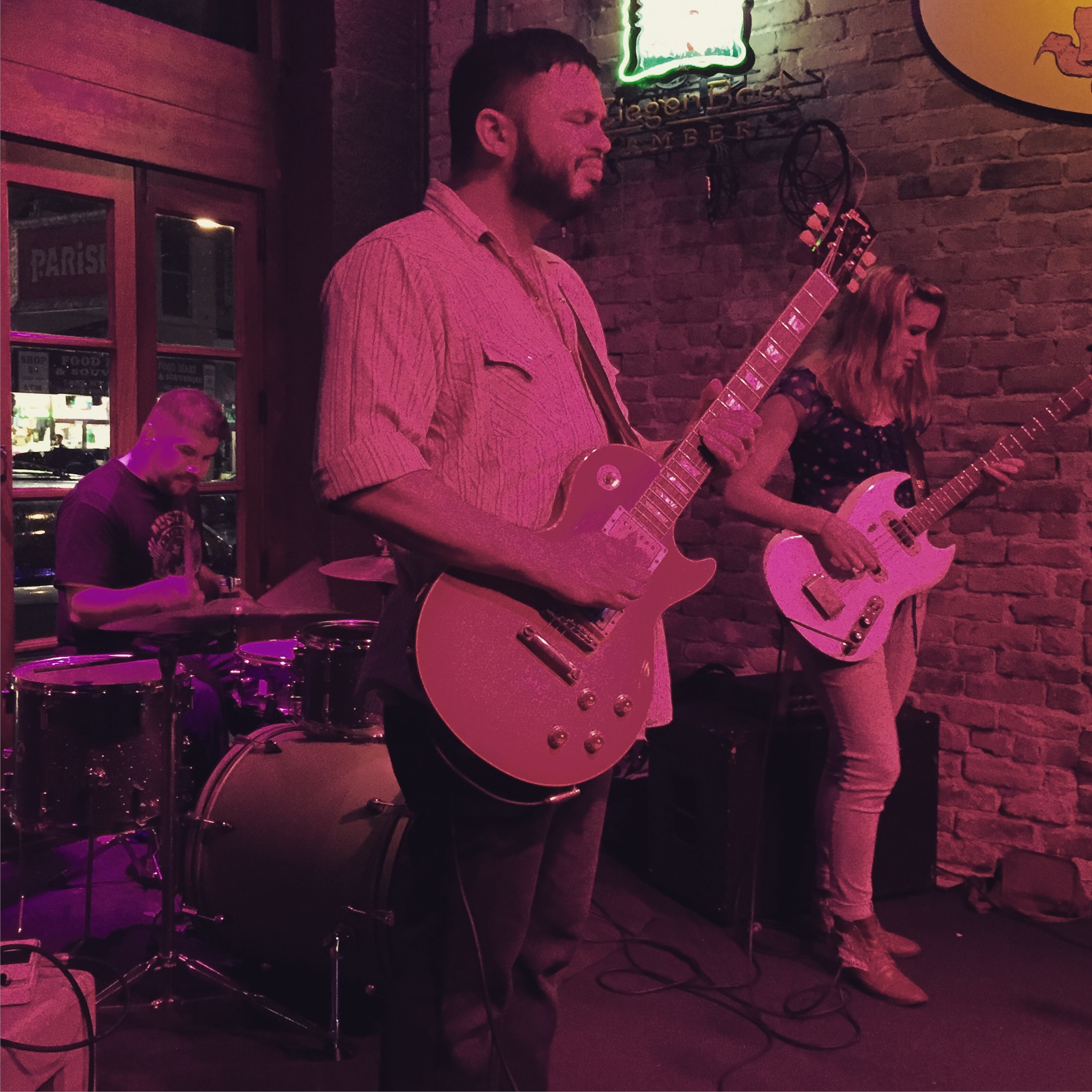
HITEC days always end with numerous dinners and parties in the evenings. While we attended the big ones such as the Samsung and Newmarket events, the local bar scene also provided some great alternatives. We were (or maybe I was) particularly lucky with the live music at two of the places we went to - that made the evenings were the rest of the people enjoyed a drink or two or three very enjoyable for me as well, not to mention that it was the last time I got to see some of my colleagues (at least they might not be "colleagues" any more next time) and of course also a few people from other companies, it's a small industry after all.
Everything was over on Friday and I left Austin at 10am in the morning, to arrive back in Dubai on Saturday evening at 8pm - a long journey indeed, but those two weeks were definitely worth the travel time.
San Francisco - WWDC 2015
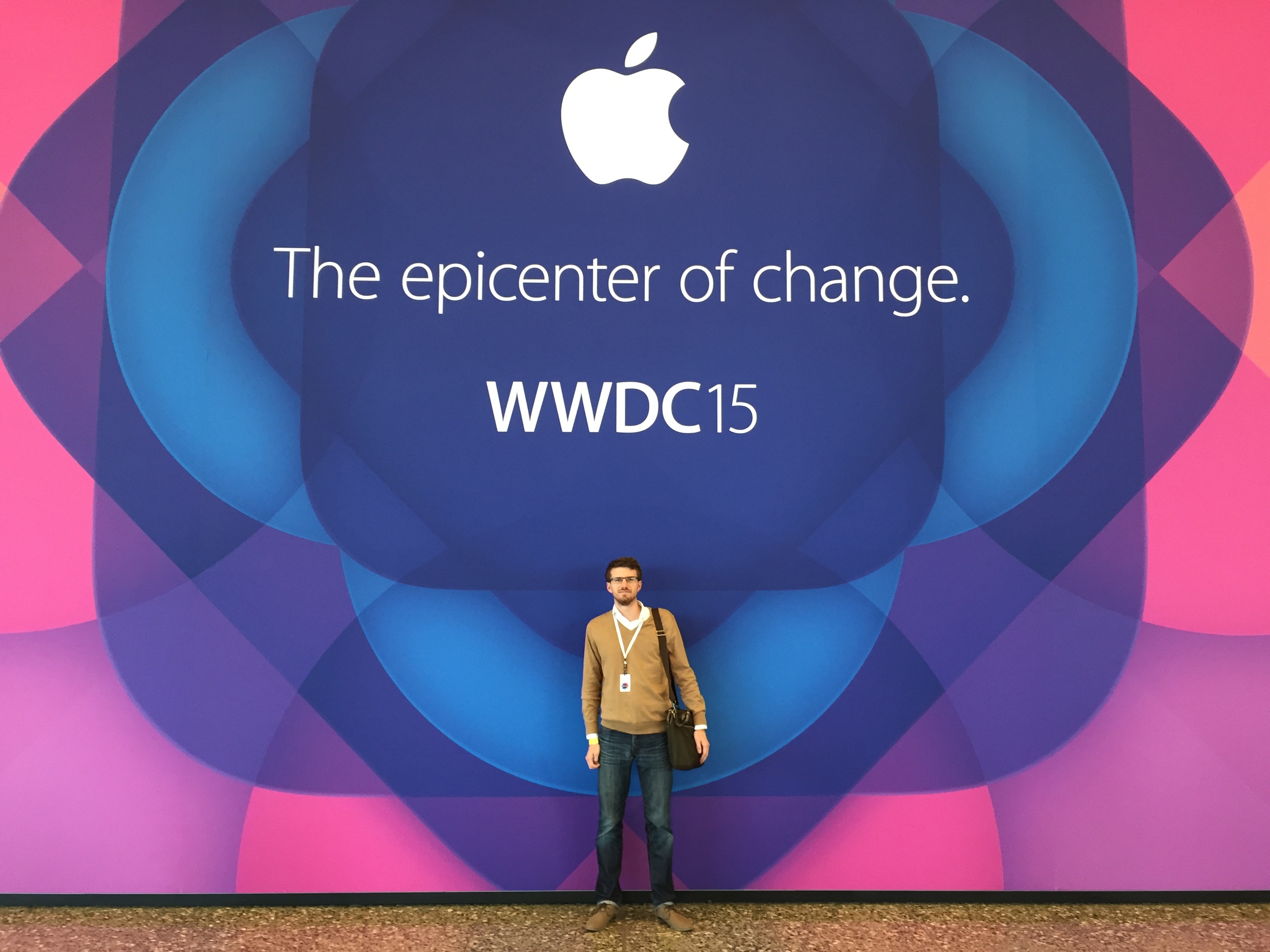
This year, I had the chance to attend WWDC, Apple’s Worldwide Developer Conference in San Francisco. While the conference is mostly known for its opening day keynote, it’s actually a full week of sessions and events.
This year, I had the chance to attend WWDC, Apple’s Worldwide Developer Conference in San Francisco. While the conference is mostly known for its opening day keynote, it’s actually a full week of sessions and events.
I’ve never thought about attending previously, but this year I got an E-Mail from Apple announcing that registration was open. Knowing that the chances of actually getting a ticket are quite low - they used to sell out in minutes, but since 2014 Apple holds a lottery to assign the around 4000 tickets - combined with the fact that it just takes two clicks to buy a ticket on Apple’s online store, I went ahead and registered. Surprisingly, I found myself waking up to a confirmation E-Mail two weeks later, which meant I had to sort out flights and a hotel. Luckily, I had to be in Austin the week after for HITEC, hence a US trip was already on the cards.
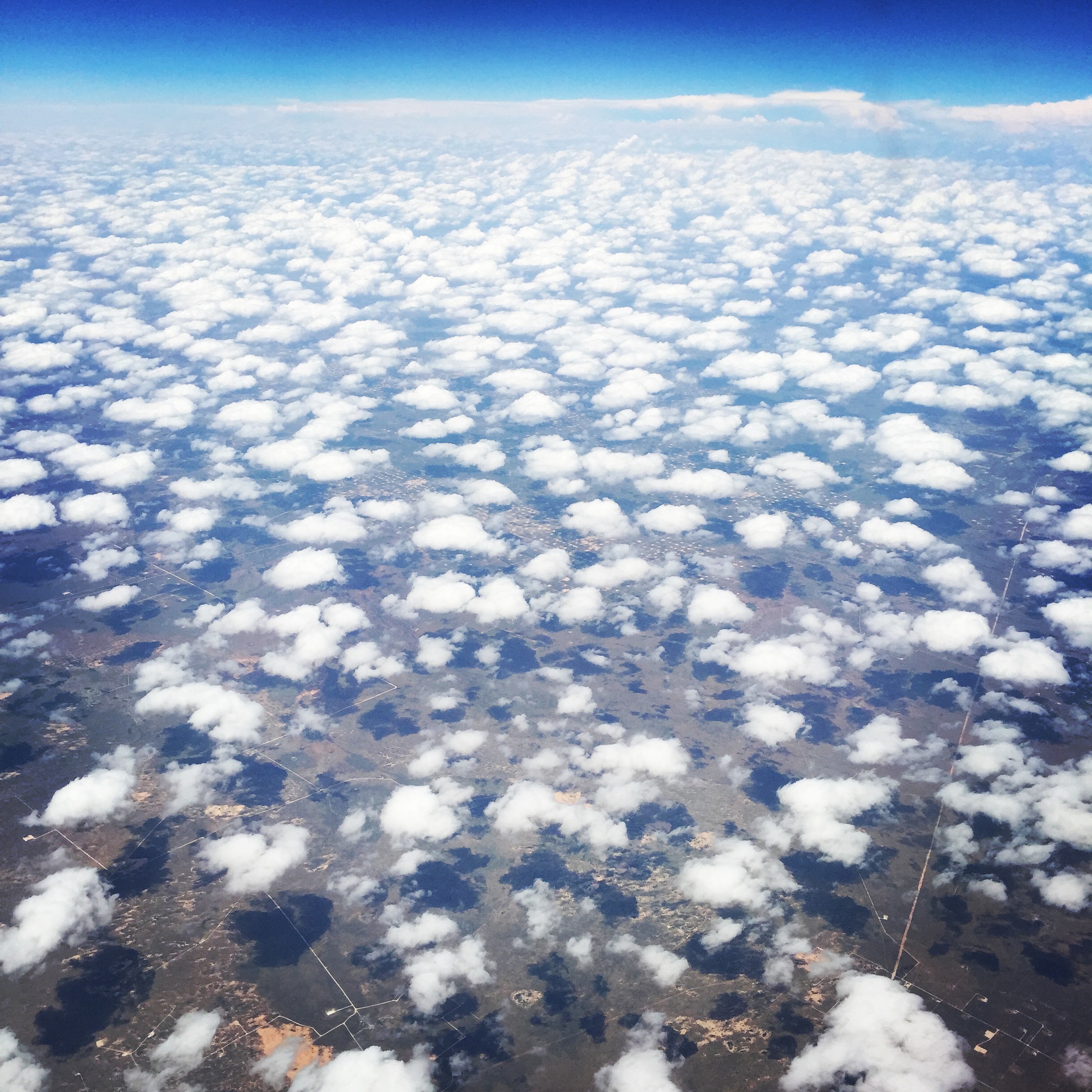
I flew in on Emirates from Dubai on Saturday before the conference on the longest flight I took so far - almost 15h. The flight interestingly takes the route over the north pole, another first for me. I arrived on Saturday afternoon and went for a quick walk through the city to get some dinner, before heading back to the hotel early - 11h jet lag was catching up with me.
Having fallen asleep at 6pm and woken up at 2am, I went out to collect my badge early on Sunday morning after a breakfast at the Ferry terminal and got a nice Apple jacket as well. I spent the rest of the day wandering through San Francisco and shopping a bit, before heading to bed early. On Monday, I got up at 5.30 am to stand in line for the keynote - I really wanted to see it live and I knew that not everyone can fit into the room. Judging from what other people said, it probably would have been enough to get there at 8 am or even later as well. Seeing an Apple keynote live was a great thing to have experienced. While nothing groundbreaking was announced, the first 115min were spot on and well executed, with OS X, iOS 9 and watchOS 2 all showing a lot of potential. Personally, I'm very excited about the watchOS, I think the wrist truly has a lot of potential for technology, far more than glasses for instance.
Things got a little out of shape with the Apple Music announcement. That holds true for the presentation itself for sure and remains to be seen for the product. Jimmy Iovine was just not able to bring the point across, followed by Drake, who wasn’t really able to either (but was sporting a cool Vintage Apple jacket). Eddy Cue was his usual self, but spent way too long demonstrating an application that looked overly complex and with no clear focus. I am skeptical if Apple is on the right track here, but agree it was time for them to change something.
The second session of the day was the Platform State of the Union, where Apple’s product people give a deeper dive into some of the announcements of the morning and how they affect developers. Definitely some cool features coming that will no doubt make their way into Apps we are using daily. Lastly, the annual Apple Design awards showcased some of the best apps for iOS and Mac that were released in the past year, among them my favourite calendar App, Fantastical, and a very cool demo of Accessibility within Apps, where two blind Apple Accessibility QA engineers were using the Workflow App. That was truly impressive.
In the evening, I attended two of the many events and parties surrounding WWDC each year. I was a bit late registering for the parties and events, so the RSVP list for many of them was closed. I did manage to get into the Pinterest party - which wasn’t particularly great - but also got an invite from Jim Dalrymple of The Loop to attend his AltBeardBash at the W hotel. Great location and a nice event with Karaoke from some of the more (or less) talented Apple followers in the industry. I also managed to chat to John Gruber of Daring Fireball briefly and secured a spot for his The Talk Show event for the Tuesday - which was absolutely worth it, more on that below.
Tuesday was a day with a few interesting sessions around UIWebView, WebKit, CloudKit and Enterprise deployments - much of them is at just about the right level for me - not being a developer - to still get a lot of value out of them, and addressed a number of points that are relevant for what I am doing in my current job. I also couldn't resist snapping a photo with Craig Federighi - Apple's SVP of Software Engineering, who is gaining fame in the geek world with his appearances at Apple's product introduction keynotes.
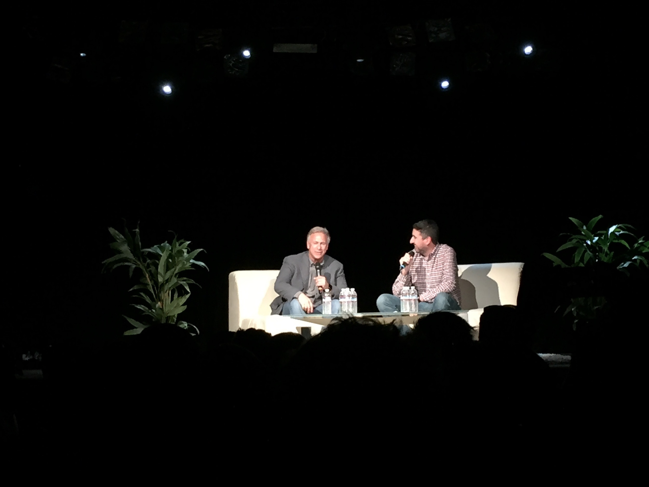
After the sessions, I headed over to John Gruber’s Talk Show event, who amazingly had Phil Schiller, Apple’s SVP of Marketing and known from many of the presentations, as his interviewee. Funnily enough I had seem him a few minutes earlier at Moscone and he was talking to someone about “walking over” - I had a hunch he might be part of the Talk Show. While the interview wasn’t groundbreaking, it was great to see them discuss some of the recent controversial topics in a somewhat private and casual setting and really shows how Apple's approach to PR has changed in the last years.
My highlight on Wednesday was a presentation by Debbie Sterling called “Think Audacious” about her journey as an Entrepreneur and the goal to bring more women into Engineering and Technology, as well as sessions on Safari and Webkit, since we work a lot on web apps at iRiS, and many of the our ongoing issues are being addressed in the upcoming releases. I also briefly attended Pebble’s / Atlassian’s WWDC party in the evening.
On Thursday, I had to take a care of a few work related things, so could not attend as many sessions as I wanted. I did see the lunch session with Disney's animation legend Floyd Norman, who gave a nice talk around how Disney's techniques evolved over time. In the evening, Apple had its yearly Bash at the Yerba Buena Gardens, with free food and drink as well as a performance by Walk The Moon, which was pretty neat. Surprisingly, developers are actually capable of enthusiastically enjoying a live performance!
Friday was the last day of the conference, with a few interesting sessions, among them new features in UI Dynamics, Notifications and the new system fonts in Apple's Operation Systems. I found topics like UI Dyanmics or the system font were particularly interesting, as many of the concepts involve bring together other disciplines - it's very typical for what Apple calls the intersection of technology and liberal arts. While my knowledge on typography is limited at best, it's easy to take good looking fonts for granted, when in fact there is an incredible amount of thinking, design and research behind them. The lunchtime session was a great talk on planet discovery. It's great that Apple is breaking up the presentations and labs with some broader talks on science, creativity or entrepreneurship.
After a short night's sleep, I headed to the airport to fly over to Austin for HITEC. More on that later. All in all, I'd recommend to attend WWDC at least once to anyone who is working on a product in Apple's ecosystem in some technical capacity. While there is most value for developers, even if you are not actually writing the 1's and 0's there are many sessions and labs that are useful on a higher level. I am not sure I'd fly in from Dubai just for WWDC every year, but since I had to go to the US anyway, it was a no brainer.

